Using Duo Security Two-Factor Security at SUNY New Paltz

Using Duo Security Two-Factor Security at SUNY New Paltz

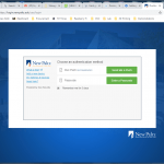
SUNY New Paltz is in the process of adding Two-Factor Authentication (2FA) to their adminstrative computer systems, and I have been trying it out.  This is a report on some of the things I’ve learned, such as how to get it to remember you for 5 days without having to accept all third-party cookies.

Two-Factor Authentication

A lot of people are familiar by now with Two-Factor Authentication.   After you log in with a password (something you know) a message of some sort is communicated to you through a secure channel to a device assumed to be under your control (something you have).    You then have to prove that you received this message, to prove that it is really you logging in, not just someone who has stolen your password.

A very familiar example is 2FA on Google accounts.  When you log in with your password, Google sends a 6-digit code number as a text message to your mobile phone. (They will also call you on a voice land-line, if you don’t have a way to receive texts.)  You then type in that 6-digit number to complete the authentication process.   Facebook does something similar, but you use the Facebook app on your mobile device to get the 6-digit code, which changes every few minutes. I highly recommend enabling 2FA on both Google and Facebook.

New Paltz is using a 2FA system from Duo Security, which can work the same way, sending you a 6-digit “passcode” for you to enter as part of the authentication process.  But Duo also offers the option of a “push,” in which the message is sent to an app on a device assumed to be under your control, and only your control.   In that case you can simply push a button on the app to accept the authentication (or another button to deny it).   You don’t have to type in the 6-digit number.   The device can be  a mobile phone, a “dongle” device you carry on your keychain, or even an Apple watch.    Here is the challenge page you will see after you enter your password:

Figure 1. Duo 2FA challenge page

Click on  “Send me a Push” and then press the “Accept” button on your mobile device and you are in.  Easy.

Apple Watch

I have an Apple watch, which makes using Duo 2FA very easy.
After I’ve entered my password I click “Send me a Push,” and a screen on my watch comes up with the name of the site or service to which I’m trying to authenticate, and a button to Approve the connection (See Figure 2).

Duo Security on Apple Watch
Figure 2: Duo Security on Apple Watch

There is another option under that, to Deny the connection, but I have to scroll down for that option. So far I have not accidentally pressed Approve when trying to scroll down to get to Deny but it’s a concern.

I prefer using the watch for authentication, but I have learned that if I have recently been using my iPhone and it is still open then the “push” will go to the phone and will not go to the watch.   That is confusing at first, when you expect the push on your watch and it does not show up there.   Check your phone.

(Maybe they could make it show up on both the phone and watch?)

In order to use the Apple watch app I had to install the iPhone app first, and then open the Apple Watch controls and find the Duo app there and enable “Show App on Apple Watch”.

Third-Party Cookies

When you initiate authentication and the Duo challenge page comes up, there is the option to have the device remembered (and authorized) for 5 more days.   You can see a checkbox for this in the Challenge page in Figure 1.   You can also see the disclaimer that “You need to enable cookies in order to remember this device.”   What they actually mean  is that you need to enable third-party cookies, which are cookies set on your browser from a site other than the one you are visiting.   Even if you have enabled cookies in your browser, you will find that you are unable to check that box if your browser does not allow third-party cookies.

By default, I turn off third-party cookies.   They are used for tracking by advertisers, which I prefer to avoid, and I can’t help but think they are a potential security weakness, though as of this writing I don’t know of any active exploits.  The compromise is that browsers let you make exceptions, blocking most third-party cookies but allowing them from selected sites.  Using Chrome, I found I could enable this 5-day “remember me” feature and still block third-party cookies in general if I made this exception for the site:

[*.]duosecurity.com

The special characters at the beginning are a “wild-card” match pattern, which is necessary because the hostname part of the URL seems to change from session to session.  (In contrast, when I found how to enable Starfish Early Alert with a single exception for third-party cookies the hostname was specific to our campus.)  The same should work with Firefox.

Although I have not finished testing yet, it seems that authorization is based on IP address, which means that if you use Duo 2FA on your desktop computer using one browser, then you are automatically authorized using a different browser.   Does this required checking the “remember me” box or is it automatic?  I am still trying to figure that part out.

Visualization of the Cislunar Potential

Visualization of the Cislunar Potential

In the past few days I’ve been following the playback of the Apollo 11 mission in “real time” (delayed exactly 50 years) at https://apolloinrealtime.org/11/.  Among all the news related to the 50th anniversary of the Apollo 11 moon landing I also found an article from NPR about about 3 different approaches to how to get to the moon, and how the one they used almost wasn’t ( Meet John Houbolt: He Figured Out How To Go To The Moon, But Few Were Listening).  This has caused me to think a bit about how to visualize the gravitational potential between the Moon and Earth (“cislunar”1) and how the path chosen for the mission was somewhat like a car driving up a mountain to go over a pass to a valley on the other side.   As a result, I wrote a short Python script to show the potential as a surface over a 2 dimensional plane, and then “played” with the color map and other effects to highlight that “mountain pass” between the Earth and the Moon.

I’ve included a derivation of the equation for the gravitational potential for those who are interested, but it’s down at the end (for those who are not).  The Python script which was used to create all these images is at http://www.spy-hill.net/myers/astro/cislunar/CisLunar.py.  See the comments in the code for the small changes needed to turn one into the other.

Visualized as a Terrain Map

This first plot shows the potential surface with a color map commonly used for terrain, where sea level is blue, lowlands are green, mountains are brown, and mountain tops are white:

Figure 1: Cislunar potential using a terrain color map.

The idea is that going to the Moon is like climbing a mountain. Going up a hill increases your gravitational potential energy, and the same is true when a spacecraft goes up this surface on the way to the moon.  The blue at the bottom of the left potential well is the Earth, and the dimple up the hill to the right is the Moon.

The x and y coordinates on this figure are measured in units of the radius of the Earth (symbol R). The vertical scale is logarithmic2 to make it easier to see the variation on a reasonable scale. The horizontal spacing is to scale: the Moon is a little over 60 Earth radii from the Earth.   The bottom of each potential well is flat and to scale.  That shows the small size of the Earth and the Moon compared to the distance between them.

Viewing from the side shows the variation in “elevation” a little better:

Figure 2: Cislunar gravitational potential with a terrain color map, side view.

Now you can at least start seeing the idea that going to the moon is like going up a mountain and then down into a valley.

Visualized with Color Contours

The problem with the images above is that the color map changes gradually, so you cannot see the subtle changes at the “mountain pass”.   To help visualize that more clearly I switched to an artificial color map3 which varies between colors more often and uses more distinct colors.  Here is the result:

Figure 3: Cislunar gravitational potential using the ‘prism’ color map to show smaller changes.

Now you can see that the “mountain pass” actually looks like a narrow gateway. This becomes clearer if you zoom in on the moon:

Figure 4: False color contours of the cislunar potential, close up near the moon.

If you want to get up and over by using the least amount of energy (and thereby the least amount of fuel) then you would want to go right through the center, following the yellow V  up to where the color turns just a little green and then turns back (down) to yellow.  This shows that it’s a rather narrow mountain pass, so maybe it’s better to describe it as a gateway.

It is tempting to try to identify the “gateway” point as the Earth/Moon  Lagrangian Point L1, but it’s not, although they are probably close.   At the L1 Lagrangian point the Earth’s gravity is just slightly stronger than the Moon’s, such that an object there would orbit the Earth with the same orbital period as the moon (and thus if left there would simply follow along  with the moon, sort of like flying in formation).   The whole analysis presented here neglects the fact that the moon is actually in motion around the Earth, and to the extent that we are ignoring that motion the mountain pass is essentially the L1 Lagrange point.  To really get it right we would want to add the “effective” potential for an orbiting object.

Visualized with  Contour Lines

One friend I showed this all to had a little trouble visualizing the idea with the false color map, because the colors can look like “bumps”.   So I also plotted the surface using just contour lines, with the following result:

Figure 5: Cislunar gravitational potential near the Moon, using contour lines.

I like how one of the contour lines, which starts out “downhill” from the moon, actually loops back behind the moon.   This representation is the closest to a topographic (“topo”) map, where contour lines show elevation (and thus also gravitational potential energy).

That figure just shows the moon, but when you back out a bit to show both the Earth and Moon it also helps cement the idea of  gravitational potential as elevation:

Figure 6: Cislunar potential of the Earth and Moon.

Derivation of the Gravitational Potential

For completeness, here is my derivation of the expressions used in the script for the gravitational potential.  To start, the gravitational potential (symbol V) is the gravitational potential energy (symbol U)  divided by the mass of the spacecraft.  Dividing by the mass of the spacecraft makes the result proportional to U but independent of m, and thus we can think of it as being a property of the space at that point, independent of what is there.   And to get the potential energy, just as with electricity, multiply the potential by the amount of “charge” (in this case mass) at that position: U=Vm.   Now we just need to compute V.

To get the gravitational potential energy we can start with the force between the Earth or Moon and the spacecraft, which is given by Newton’s Law of Gravitation:

where M is the mass of the planetary body, m is the mass of the space ship, d is the distance between the two (center to center) and GN is Newton’s constant of gravitation.  This is the magnitude of the force — the direction is of course attractive, through the centers of mass of both bodies.   If we integrate this, from the surface of the Earth up to the position of the space ship, we get the gravitational potential energy. Then, to get the potential we divide by the mass m of the spacecraft to get
This equation holds for both the Earth and the Moon (for different values of M), and we can simply add the two to get the total gravitational potential at any position.

The code I used to make the images is available as a github gist.

Notes

  1. The word “cislunar” means “between the moon”, while the word “translunar” means “from the Earth to the Moon”.  https://wikidiff.com/translunar/cislunar
  2. Since the potential is negative, I actually use the logarithm of the absolute value of the potential, and then put the minus sign back in for the downward direction
  3. the ‘prism’ colormap from matplotlib

Summer Solstice 2019 in Wooster Hall

Summer Solstice 2019 in Wooster Hall

As we have done in past years, a small group of those interested came to Wooster Hall to observe the skylight lights cross over the staircase at Solar Noon (at 12:58:16 EDT). This year the actual Solstice (at 11:54 EDT) was very close to the same time, which is not always the case. Raj Pandya, director of the John R. Kirk Planetarium, lead everyone there through the simple calculation of the highest angle of the sun that day.
I set up my network camera to make the following time-lapse video:

The reason we are all supposedly there is to watch the bars of light crossing the upper staircase, but it looks to me like people were more interested in everyone else. Which may be as it should be.

Cleaning Pennies with Taco Sauce

Cleaning Pennies with Taco Sauce

I have been collecting old pennies for a science experiment.   (The composition of the penny changed in 1982, which changed the weight slightly, and I will soon have a student exercise that makes use of that weight difference.  Stay tuned…)    I wanted to clean the pennies enough that they were recognizable as pennies, and so that you could clearly read the date, and also so that at first glance you didn’t know if they were older pennies or not.

Doing some reading on the Internet I found that you should not clean pennies if they are old and potentially valuable.   So the one 1940 “wheatie” that I found in the pile will not be the subject of today’s experiment.   The suggestions I found for just getting the oxide layer off were to use a weak acid, like vinegar, and perhaps throw in some salt, which somehow makes the acid work better.

Then I found someone who pointed out that these two ingredients, vinegar and salt, are key components in ketchup, so you should be able to clean pennies with ketchup.  Or they had actually done so.  I don’t remember which, and I don’t have a link, because it doesn’t matter, because it’s a testable hypothesis.   Only I didn’t have any ketchup available in the lab.

But I did come across some taco sauce at dinner, so I decided to put that to the test.   I took 16 rather tarnished pennies and put 8 each into two different brands of taco sauce for 5 or 10 minutes.   See Figure 1.  (I didn’t watch the clock – I had an intervening  conversation with a colleague so that’s only an estimate.)

Pennies soaking in taco sauce
Figure 1: Pennies soaking in taco sauce

During the process it seemed to me that the brand on the right was doing a better job, but in the end I’m not so sure.   I rinsed them off with water and dried them and arranged them with the worst side up (if there was a worse side), and from the photo in Figure 2 I can’t really say one did a better job than the other.

Pennies after cleaning.
Figure 2: Pennies after cleaning.

What is more notable is that there is a wide variation of the  results within each treatment group.   Maybe some of those pennies needed more time, or need a second round of hot sauce?

I have to admit that I was not careful enough to document the pennies before the treatment.   The lines of pennies above each packet were taken from the same source of pennies and show about the same levels of oxidation as the pennies I used, but they are not the same pennies.  So what you can clearly see is that the treated pennies are cleaner and shinier, which was the goal, and both brands of taco sauce did about the same job.

Further investigation is clearly warranted, so I may stop by Taco Bell tonight…


Vernal Equinox 2019

What a difference a year makes. Last year I made a time-lapse video of the Vernal equinox in Wooster Hall by standing next to a wall and taking a photo about once a minute for an hour. This year I have a much nicer video from a raspberry pi camera which captures an image every 5 seconds. Here is the result:


I’ll edit this post later to provide more information, but for now I’m posting it in the hopes that the video is useful for tonight’s event, which alas I will miss because I teach a lab during that time. Enjoy!

Added the next day…

Here are some of the details about how this video was created.  You can compare this to how I did it a year ago and see if you think I’ve made progress.

First, the images were all captured by a Raspberry Pi 2 with attached camera, driven by a Python script which is started at boot time (unless there is a mouse or keyboard plugged in to a USB port).    The camera simply takes an image every 5 seconds and saves it.   No further processing is done on the Pi.

Then I take the Pi back to my lab and plug in a monitor, keyboard, and mouse.  The only reason for the mouse is to inhibit starting the camera.   I zip up the images into a tarball and copy that to a memory stick, which I then take to the Mac in my office.

The Mac runs the free version of the software TLDF  (the name comes from “Time-Lapse De-Flicker”).    I drag the files into TLDF, check the box for “Blend” and set it to blend 3 frames, and press “Render”.   It does the rest, and produces an MP4 video.   That’s it.

It’s not as fun as writing my own Python script to do variable duration frames in an animated GIF, but I sure do like the results.


YSC-4 Electronic Clock

YSC-4 Electronic Clock

I’ve just completed building a small electronic clock from a kit, the YSC-4 kit from HiLetgo, which I was able to purchase from Amazon for under $9.1   My interest in this kit was to find something simple that is nevertheless good soldering practice for advanced beginners, and I was not disappointed.

Overview

The kit provides practice for a number of things that students should encounter:

  • an electrolytic capacitor  (requires specific polarity)
  • a buzzer (also has specific polarity)
  • a transistor  (three close leads, and requires proper orientation)
  • an IC socket, and the IC itself (oriented by a notch, and soldering close contacts)
  • segmented display digits (orientation and close contacts)
  • 2 momentary contact switches (orientation)
  • a network resistor pack (orientation and close contacts)

This version comes with a wall-wart with USB socket and a USB cord to the power socket.   I have since found a variation from another vendor (without the wall wart), which comes as a two-pack .  Yet another version, which costs slightly less, has just terminal posts for the power, though I think students are more likely to use their creation if it has the USB power cord.

It took me under an hour to assemble, even with a break for a snack. A beginner might take longer, but would have no difficulty. The kit included a piece of paper with a list of components and a circuit diagram, along with (somewhat confusing) instructions on how to set the time and alarms. The kit did not include step-by-step assembly instructions, but since the PCB is well marked it is clear what goes where, and so step-by-step instructions really are not necessary.  The one piece of advice to give to students is to start at the center of the board and work out, to make access to the leads easier when soldering.

Tips and Tricky Bits

Perhaps the trickiest thing in this kit was the  orientation of the network array; it has a dot on one end and markings on the PCB to show which end goes where.  We all missed that at first, so some boards had to have that component removed and resoldered.  Another tricky point was the switches, because it was not clear at first without testing with a meter which contacts are always joined and which are only joined when the button is pressed. Rotating the switches by 90 degrees will be the same as having the buttons always pressed down. As you might be able to see from the photo, the leads go on the sides, not the top and bottom.  It helps to think of the leads as two sets of flat straps that go across the switch from one side to the other.

Another thing that might trip up beginners is the orientation of the segmented display (the decimal points go at the bottom, as does the writing on the bottom side).  Unlike other PCB’s I have worked with, there are no components where you have to guess the orientation

Some other things to note:

  • This clock has a 24 hour display (no 12 hour display).
  • It will chime 3 times on the hour (unless you turn that off).
  • There are two alarms.   When initially turned on, the time  is 12:59 and the two alarms are enabled and set to 13:01 and 13:02.
  • There is no back-up battery, so you have to set the time (and alarms) again if you ever unplug it or it looses power somehow.

The display is very bright, but since the segments in the segmented display are white when not lit it can be hard to read the time from the bare clock face.  You can see this in the photo at the top of this post.  The solution to this is to cover the display with red or grey tinted plastic, so that only the lit red segments are visible.   I had a roll of red “tail light repair” tape which is 2″ wide and it fit perfectly, as shown here:

YSZ-4 clock with red tape over the display

However, we’ve learned not to put the tape on the display until the clock is working, as it obscures the decimal points at the bottom, leading to more problems with the display ending up upside-down.

We have had some success with replacing the buzzer with an LED, though it seems that the LED may eventually burn out, so it might be wise to add a resistor in series.  One student tried to put an LED in parallel with the buzzer, and that failed, but again maybe adding a resistor would make it work (that has not yet been tried).

Operating Instructions

The operating instructions that came with the kit are written in English, but appear to be a direct translation from Chinese and are somewhat confusing.   I found another set of instructions on the net that are also Chinese written in English, but differently.   From those and my own experience I was able to put together these operating instructions:

Switch S1 (on the left) is the Menu button.   An initial long press enters the first menu.  The menu pages are named A, B, C, D, E,  etc., and the menu letter is shown in the first digit of the display.   A short press on S1 takes you to the next menu.   You can only exit the menus by stepping through all of them; a long press will make them step through quickly  (but if you don’t remove pressure at the right time you’ll start the menu list over again).

In each menu, switch S2 (on the right) is the toggle/increment button.   On each menu page, us it to toggle a feature on or off, or to increment a numerical value.   For numerical values you can hold the button down and the count will go up automatically.

The menu pages are:

  • A – Hours, from 00 to 24  (there is no 12 hour option)
  • B – Minutes, from 00 to 59
  • C – Hourly chime.  If enabled the clock will beep 3 times on the hour, but only  between 08:00 and 20:00.
  • D – First Alarm on/off
  • E – First Alarm hour
  • F – First Alarm minutes
  • G – Second Alarm on/off
  • H – Second Alarm hour
  • I – Second Alarm minute

If an alarm is turned off then the menu will skip the hour and minutes items for that alarm. There is no way to exit the menu pages early; you must cycle through all of them to get back to normal operation.

Outside of the menus, a short press on switch S2 will change between displaying hours and minutes or displaying minutes and seconds. While the minutes and seconds are displayed, a long press on S2 will reset the seconds to zero, and then a short press on S2 will start the clock again from 00.

When an alarm is sounding there is no way to turn it off.  You just have to wait for it to finish.

Co-Curricular Transcript

Students at SUNY New Paltz can participate in a 4-Step training program in electronics soldering, where construction of this clock is the 4th step.  Once the clock is shown to work they can a certification added to their co-curricular transcript.  The student must request this certification; the instructor cannot give it without a request.

To request certification go to my.newpaltz.edu and click on “Student Engagement” in the main menu.  Then click on Co-Curricular Transcript in the Student Engagement menu.  In the search form enter “solder” in the Keyword field and press “Search.”   Click on the item and fill in the form.

3D Printed Case

Students can have a case for the clock 3D-Printed at our Hudson Valley Additive Manufacturing Center.  Payment must be made by credit or debit card after you submit the STL file.   The cost is around $1.30.  Under the “Resources” menu on the HVAMC page open the “Submit a Build” item and click on “Students”.    The STL file describing the case is YSZ-4_ClockCase.stl, but it will have to be renamed for submission (see the instructions on the submission form).  It was created with OpenSCAD.

More info…

The chip used in this kit is an Atmel AT89C2051 micro-controller, which is capable of much more than just being a clock. The vendor (or someone) must have flashed the IC with a simple clock program for this kit.  Maybe it would be possible to re-flash it to allow for 12 hour mode. Anybody up for this challenge?

Also, I tried powering it with a single 3.2 Volt coin battery, and that worked initially, but drained the battery very quickly, so it’s not really a viable option.

These instructions by clobber24 on Instructables for a C51 4-Bit Clock  apply, except for the power jack.  That page also links to 3D printed cases.  He printed a battery case for three AAA batteries, which he says worked, but he does not report on battery life.

Notes

  1. in 2019.  The cost is slightly higher now.

Welding Ventilation Estimate

Welding Ventilation Estimate

I have been investigating the requirements for students to be able to weld on campus, which is needed for our Baja SAE team, for projects for our Engineering Senior Design course, and for other various engineering projects.  One of the requirements is, naturally, adequate ventilation.   Specifically1

Adequate ventilation providing 20 air changes per hour, such as a suction hood system should be provided to the work area.

We have considered several shop rooms as a possible welding space, but it’s not clear if they already have sufficient ventilation or what it would take to add enough ventilation capacity.   What I realized today is that it is useful to turn the question around and ask:  for a “standard” amount of ventilation, how big a space can be properly ventilated to obtain 20 air changes per hour?

What is a “standard” unit of ventilation?   I have a regular old box fan in my lab, and I was able to measure the speed of the exiting air using a borrowed anemometer.  Fans like this are ubiquitous on a college campus, so I’ll chose that as the standard.   The dimension are 19″ × 18.5″, for a total area of 2.44 square feet.   I could compute the flow rate (volume/time) by multiplying the area by the speed of the air exiting the fan (in the same linear units!),  but this anemometer was so smart that if I enter the area it automatically gives me the flow rate in cubic feet per minute (CFM).  The flow rate varied with position around the fan, so I took what seemed like a representative average of measurements all over  (we could do this better, but I just need a ball-park estimate).   There are three speeds: low, medium, and high.   The results were:

Low: 1750 CFM,   Medium: 2250 CFM,   High: 2650 CFM

Just to use a rough order-of-magnitude estimate I will use 2000 CFM in what follows (mostly).

Next, I need a unit of volume.   One of the rooms that is being considered for welding is room 008 in the basement of Resnick Hall (RH 008).   That room has a roll-up door which happens to be exactly 8 feet wide and 8 feet tall.  I need a unit of volume, not area, so I’ll imagine a cube that goes 8 feet back from that door, for a total of 8’× 8′ × 8′ = 512 cubic feet.    This is about the size of the smallest PODS storage container, so I will call this a “pod”2 (their container is actually 8′ × 7′ × 7, but this is close enough for our estimate).

The questions then are 1) how many “pods” can a single box fan ventilate (at 20 air changes per hour), and 2) how many pods does it take to match the volume of the room in question?  If the numbers are wildly mis-matched then we  know we can stop there.  If they are close, then we can refine our calculations, or just make sure we add an “engineering margin” to be sure we are over the required capacity.

First, how many “pods” can a single box fan ventilate?  Let’s call that unknown N, and compute it by setting the required ventilation rate equal to the measured rate:

On the left we have the required flow rate for 20 times the volume of N pods (in cubic feet) every 60 minutes.  On the right we have a representative flow rate for a box fan, in cubic feet per minute.  I’ve taken care to use the same units everywhere for time and volume.  Setting these equal and solving for N gives:

The numerical value comes out to be 11.718, which I will round up to 12 pods. (Using 2250 CFM for the “Medium” setting on the fan would give 13 pods.)

But I have to take into account that the ceilings in RH 008 are rather high.   They are certainly more than 8 feet, probably more than 12 feet, and maybe even 16 feet.   Since this is only an estimate, I’m happy to perhaps go over a bit and guess 16 foot ceilings, which means we have to imagine two of these pods stacked on top of each other.   Then the corresponding floor area we can ventilate with one box fan ends up being half the number, or 6 pod “footprints” of 8′ by 8′.

If the floor area of RH 008 is about the same as 6 of these 8′ by 8′ pods, then we are okay with just one box fan.   If it’s twice as large, then we can use two box fans.  If it’s as much as as four times this then we could put 4 box fans across the bottom of the sliding door and have enough ventilation.

If we need multiple box fans across the opening then I imagine they might be in a frame, perhaps with wheels to make it easier to move in and out of place.   The box fans are 19″ wide, and with some allowance for the frame that means we could get as many as 4 across the opening.   That would cover 4×6 = 24 pod “footprints”.

And note that the estimated 2000 CFM for one box fan was closest to (and under) the “Medium” setting.   We can easily re-work this estimate with the fan(s) set on “High”  if needed.  This will give us an estimate for the upper bound of possibility.  Using 4 box fans set to “High” at 2500 CFM would give 24 × 2500/2000 = 30 pod footprints.

My purpose here was to make an estimate to see if we could use one or a few box fans to ventilate a particular room, but the method can easily be applied to any other room, because a box fan provides a reasonable standard of ventilation, and a “pod” of 8’× 8′ × 8′  or with a footprint of 8’× 8′ is a representative unit of volume which one can easily picture in any room – no tape measure required.  We can use this to quickly rule in or out the possibility of ventilating any candidate space.

  1. See https://www.newpaltz.edu/ehs/safety_welding.html .
  2. Though I want to be clear that I am not offering any product or service which competes with those of the PODS company, so I hope they don’t sue me the way they did U-Haul in 2012.

Wooster Hall Rooftop Mystery

Wooster Hall Rooftop Mystery

A few weeks ago I visited Wooster Hall with a time-lapse camera to try to see what happens to the light from the skylight over the main staircase at solar noon on the Winter Solstice.  I was a few days early, but even so, I think I uncovered the basic idea, which you can review in a previous blog post.

The result is that the four columns of light that appear at the bottom of the staircase on the equinoxes now appear on the slanted ceiling near the skylight, and don’t extend down any further.   Here’s a picture (click on it for a bigger view):

Wooster Hall skylight on 18 December 2018

But as you will notice, there appears to be something in the way, preventing the columns of light from extending all the way downward, especially on the left.    What could that be?  In the original post of the video I mused that perhaps there is something on the roof which is casting a shadow.   Looking at the roof from a nearby building I could see that there are vents on the roof that are near that skylight.   And after that post I heard from the building architect that those vents are necessary to remove smoke in the event of a fire. It’s doubtful they could be moved.  But from that viewpoint I wasn’t sure that these were actually in line with the skylight, and I’m still doubtful that they are the culprit.

Someone else suggested that I could see what is on the roof using Google Maps.  That turned out to be very helpful.  Here’s the view from directly above, with some added markings (click on the image for a bigger view):

Wooster Hall from above (Google Maps).

The skylight is circled in red, and the green line shows my line of sight from the Chemistry building to the Wooster roof.  As indicated by the compass needle at the right edge, vertical on this photo is North, and as you might expect the four openings in the skylight line up with North, rather than with the building.   You can also see the vents near the skylight, the sort-of round things that are to the right and below the skylight.   But note that they are NOT directly below (i.e. South of) the skylight.  This means that they cannot be blocking the light in the way seen in the videos!   Which is what I suspected when viewing them from the Chemistry building.

So what is blocking the light?   I’m going to guess that it’s the roof itself — actually a wall which is a part of the roof.  As you can see from the photo, the roof has several levels (it’s easier to see this from the side view from the other building).   The part of the roof where the skylight is located is higher than the roof farther to the south, and there is a wall dividing the two levels.    You can see this a little better if we zoom in (again, click on the picture to make it (somewhat) larger):

Wooster Hall from above, showing the wall south of the skylight.

The orange line shows the position of the wall, which I suspect is just high enough to block the lower part of the skylight when the sun is at its lowest in the sky, on the Winter Solstice.   If you go back to the picture of the skylight from the inside, it looks like whatever is casting the shadow is larger on the left and sloping down to the right.   But keep in mind that the building is turned away from North, and the skylight image is cast on a slanted ceiling/wall  (which might even be curved).  My guess is that the shadow is actually a horizontal line, caused by the wall on the roof.

And, by the way, if you don’t see that the orange line marks the position of a wall, then go to Google Maps yourself and find this building and select the “satellite” view.   The way Google presents the images they actually change your view slightly as you drag the map, giving a sense of 3D which shows more clearly that the roof has multiple levels.  It’s pretty cool that they can do this without your having to wear 3D glasses.

Is there anything we can do to unblock the sun?   Well, at least it’s not a vent that’s  required for fire safety, but the wall is probably necessary too.   Maybe a section of the wall could be replaced with an open railing  or chain-link fence which would still provide safety to whoever is working up there, but would let the light through to the entire skylight at the Winter Solstice. Or maybe not.

I still want to get up on the roof to try to confirm this conjecture.  By measuring the distance of the bottom of the skylight to the base of the wall, along with the height of the wall, I could determine the position of the shadow of the wall for a given elevation of the sun, and verify that the shadow would reach the skylight. And maybe figure out how much the wall would have to be lowered  (instead of completely removed).   This isn’t over yet,  so stay tuned…

Winter Solstice in Wooster Hall

Winter Solstice in Wooster Hall

Wooster Hall at SUNY New Paltz has a neat feature:  the main staircase is aligned directly North/South, and skylights are positioned above it so that at solar noon on the equinoxes the bottom of the staircase is illuminated by four columns of light which crawl slowly across the floor.   It’s an exciting event on campus, for some reason.   This past spring I made a crude time-lapse video of this.   Also, on the summer solstice, and again at solar noon, the upper part of the staircase is illuminated.   I made a much better time-lapse video this time, which includes a demonstration of the reason for the change in the sun’s elevation, where I’m assisted by my 9-year old daughter, Amanda.

But what about the Winter Solstice?   There are no markings on the staircase or nearby, and in any case the sun is so low in the sky in winter that it’s not clear that there would be anything to see.   But since I’m always curious about such things, I decided I had to find out.

The weather for December 21st was expected to be overcast and rainy, so I actually visited Wooster hall earlier in the week, on two different days.  First, on Tuesday, December 18th, I was able to get the general idea of what’s going on:

As you can see, the four columns of light from the skylights move across the wall directly below the skylight,  but they don’t extend further down.

It seemed like I had gotten there a little bit late, so I came back earlier the following day.   This time I think I got the whole thing:

There is a jump at the very beginning of the video, where I repositioned the camera.  Unfortunately, I moved the camera closer to some lights on the wall, and it looks like that changed the contrast of the video and made everything darker.  Even so, you can see the whole event as the sun crosses over.

Both of these time-lapse videos were created using a very nice piece of software called TLDF  (which  stands for “Time-Lapse-De-Flicker).  Actually, I just used the free “lite” version for Mac, called TLDFLITE, and that worked fine for this project.   You can find out more about it at https://timelapsedeflicker.com/

One thing that’s very obvious from both videos is that there are not four full bars of light, the way there are at the summer solstice and the equinoxes.  There is a curved shadow that blocks the light, mainly on the left side, curving down to the right.  It’s probably something on the roof near the skylight, but I don’t quite know what.  I went to the top floor of the nearby Chemistry building to get a view of the roof of Wooster Hall, and I can see that there are ventilation stacks near the skylight which might explain the shadow, but I wasn’t sure either of them lined up quite right.

So now I want to get up on the roof to see what is in the way, and  to see if perhaps it can be moved out of the way.   If I can’t get up on the roof, then perhaps I can find someone with a drone to help inspect that area.  Stay tuned….


Skip to toolbar