https://www.google.com/fusiontables/DataSource?docid=1jNGQNPrwU-j8oWzP-gU5fKlYIC9CWThhZDruIx29
Google Spreadsheet Info


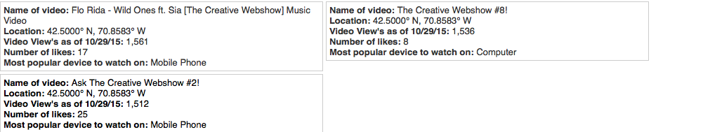
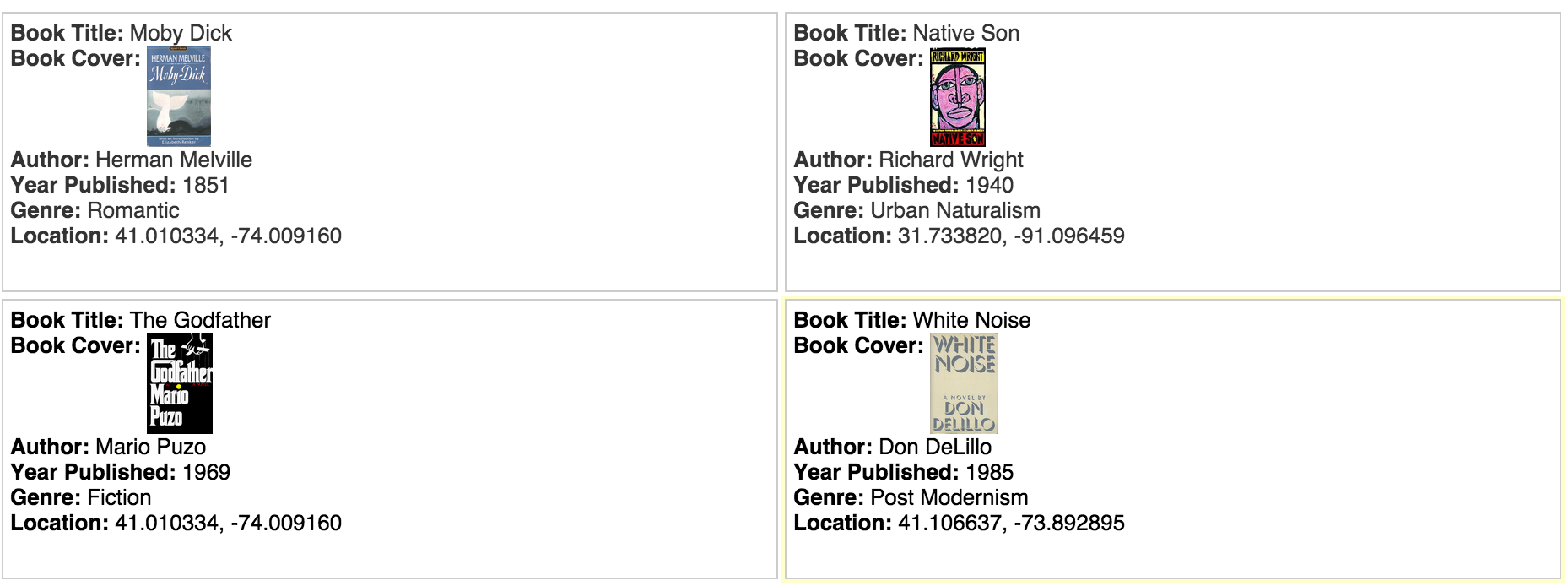
Cards

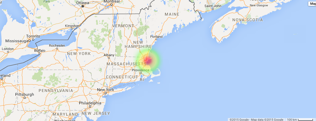
map locations of videos

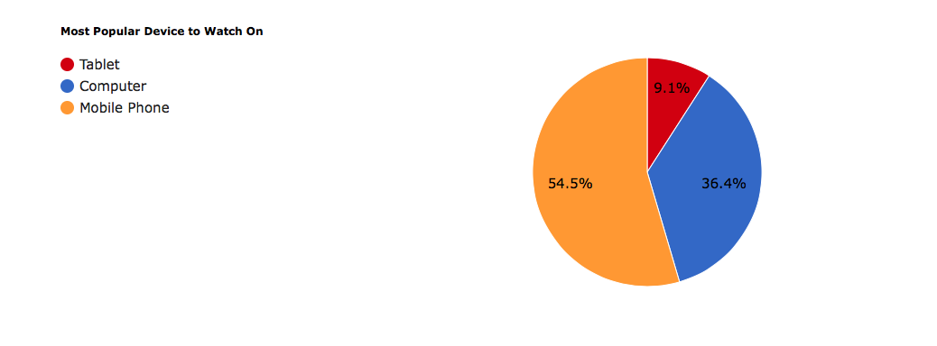
Pie graph
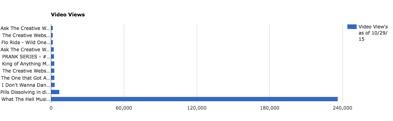
Bar graph
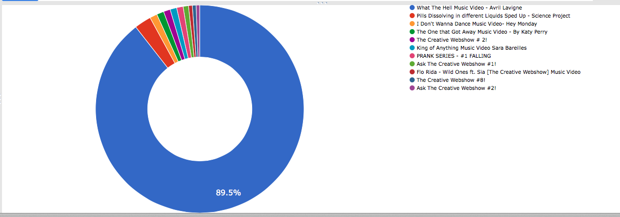
Donut graph
https://www.google.com/fusiontables/DataSource?docid=1jNGQNPrwU-j8oWzP-gU5fKlYIC9CWThhZDruIx29
Google Spreadsheet Info
Cards
map locations of videos
Pie graph
Bar graph
Donut graph
Hey everyone,
Hope you all enjoy our blog on Death Eaters in the Harry Potter series! We will explain more about it tomorrow, but for now, have fun looking around.
https://deatheaterstudies.wordpress.com/
-Hannah, Jen, and Tina
I wasn’t sure how to label in Google Fusion tables(oops), but in my graphs the X axis represents the publication year and the Y axis represents theme frequency. Overall, I liked thinking about the graph results and musing over what the data might represent.
Gun: There was a large increase in this topic from December 1st 1893 to October 12th 1893. In 1893, The Final Problem was published. Although Holmes dies (insert massive question mark here) in the story, it isn’t gun related. He plummets to his death (insert another massive question mark here) at Reichenbach Falls with Moriarty. However, he is beaten with a police baton, so maybe my topic is faulty. The topic drops the next year, rises again in 1904, and then falls until 1911. After this, the graph experiences spikes in 1917, 1922, and 1925. I looked up guns in Victorian London using victorianlondon.org, and found an entry detailing a gun involved murder from 1876. Given the later dates, and presuming that I didn’t mess up to topic, maybe it’s that guns became more available, and recognized in crime stories.

This program is very interesting and useful because there are endless possibilities to what combinations you can submit and view. For this time period however, 1800-1900, puts a limit on what key terms we can use. Therefore, literature, social issues of that time, history, and other terms relevant to that time period is the best for accurate results. 
As a social commentary, this graph shows the difference between the recorded women writers and housewives. Commonly known, women were not held in high regard for taking on professions that only men had at the time. Although having a creative mind for writing is not discriminate of male or female, during this time women writers were not commonly well respected. For that matter, there may have been many, many women writers, however they went unnoticed because of patriarchal limitations.

Although both household names, I put in Michael Angelo and da Vinci in order to see the pattern between both very well known artists. It was interesting to see that from about 1830-1875, the two had been pretty even in popularity. However, Michael Angelo became vastly more relevant during the ten years from 1880-1890. This made me curious as to why there was a sudden spike in the artists popularity. Another reason why this program is useful, it causes questions to be asked that were not thought of before. Eventually, the two artists names seemed to have evened out as they were before.
For any comparative research this program would be very useful. When two topics are submitted that are pretty much relevant to each other is when the results are most accurate.
My first Google Ngram graph features my favorite word, “prestidigitation,” and other words that relate to it [“illusion” and “magic”] so that I could see which was the most popularly used. I tried 1800-2000 first, but changed it to 1800-1900 thinking that “prestidigitation” would appear more in older texts. Here is the result:

Sadly, I was wrong. “Prestidigitation” might as well be a made-up word as far as Google Books is concerned, and that is disappointing. “Magic” and “illusion” are much more frequently used. However, nothing exceptionally significant can be seen in this graph. “Magic” seems to have a very gradual upward trend, while “illusion” does the same, less frequently. Looking at this graph, it can’t be deciphered whether these words were used in metaphor, figure of speech, or as a subject in the book. Therefore, the words’ existence is the only notable information revealed with this graph.
I can’t help wondering what “lots of books” Google is searching and how reliable this graph is as a source that can be shared with other curious readers. Is the Google Ngram function just an intriguing way to pass the time? What is the vertical axis even showing? If the word “magic” is only in 0.0013589726% of Google Books at it’s highest point on this graph, how can we gauge how many books are being searched for this data? Well, I’m not sure we can, given the next graph I made:

Out of curiosity, I plugged in the three most used words in the English language, expecting to see them all reach 100%, but they only went up to… just over 6%? What about the other 94% of books? I think this graph illustrates the number one problem with the Ngram Viewer: it does not tell you how to use or interpret the information depicted.
Overall, the concept of the Google Ngram Viewer is to see things at a very great distance, but the information shown is too general and vague to be reputable. One must be able to see/signify context to find reliable information. I think Ngrams in an interesting tool, but after reading the articles regarding the tools we use in a negative light, I can’t help but see the flaws all too clearly.


Cards

Pie Graph Visual

Bar Graph Visual

Networking Graph Between Book genres and titles

Birthplace of authors