Google Fusion Tables: Best TV Shows Starring People of Color

I chose this topic because I think it’s important for characters (as well as TV personalities) of color to have more visibility in television. Diversity needs to be reflected in popular culture for reasons that are needless to say. Throughout the years, people of color on TV and movie screens have increased yet wavered at the same time. I feel that in the present day more diverse shows are on the rise. I  chose TV shows from the past up to the present, many of which are very successful. 

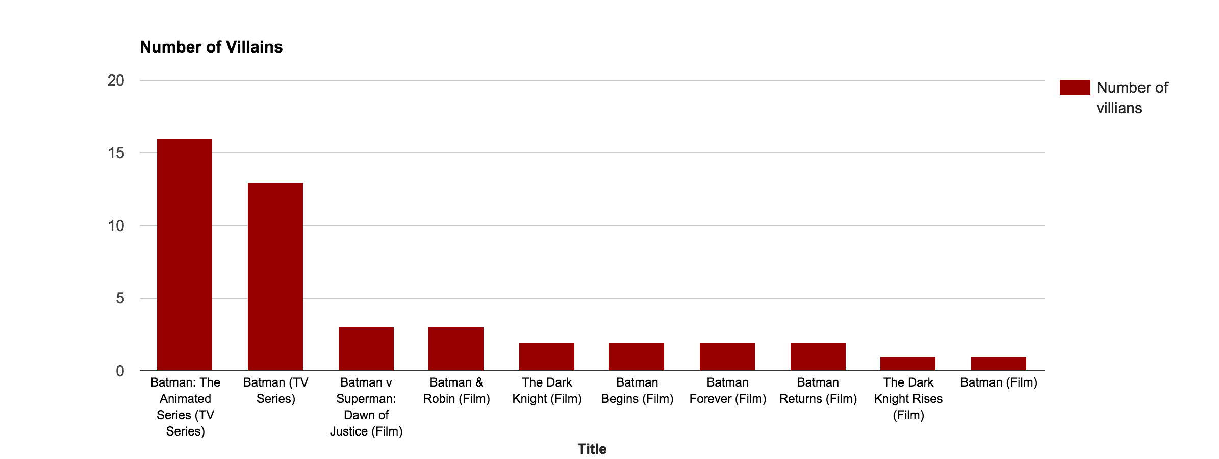
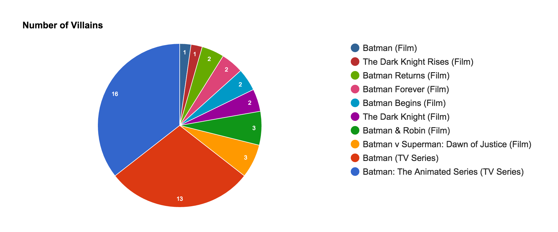
View table and spreadsheet.


Screen Shot 2015-11-03 at 7.33.24 PM

Screen Shot 2015-11-03 at 7.38.30 PM Screen Shot 2015-11-03 at 7.37.57 PM  Screen Shot 2015-11-03 at 8.05.23 PM Screen Shot 2015-11-03 at 8.13.32 PM Screen Shot 2015-11-03 at 8.09.39 PM

Google Fusion Tables: A Comparison Between My Favorite Bands and Their Success

Here’s a link to my Google Fusion Table

Default Cards

Screen Shot 2015-11-02 at 7.00.42 PM Screen Shot 2015-11-02 at 7.00.50 PM Screen Shot 2015-11-02 at 7.00.59 PMScreen Shot 2015-11-02 at 7.01.08 PM Screen Shot 2015-11-02 at 7.01.16 PM

Network Visualization 

This shows the connection between artist and genre weighting them by how many albums I have in my iTunes library, showing what genres are most influential to me. (I don’t know why the one bubble in Rock doesn’t label Kings of Leon as the artist).

Screen Shot 2015-11-02 at 7.05.16 PM


Maps

Weighted by Number of Albums (in my iTunes)

Screen Shot 2015-11-02 at 7.20.15 PM

Weighted by Number of Awards

Screen Shot 2015-11-02 at 7.22.42 PM

Pie Chart

(Continued because the list of artists didn’t fit the page)

Screen Shot 2015-11-02 at 7.33.17 PM Screen Shot 2015-11-02 at 7.34.44 PM


Bar Chart

Screen Shot 2015-11-02 at 7.48.49 PM

Different Dog Breeds vs Location vs Weight

My Google Fusion tables assignment is based off of 10 different dog breeds. I researched their origin locations and average weights to construct my visuals. 

My Google Fusion Tables

Here is my spreadsheet.
Screen Shot 2015-10-29 at 1.08.38 PM


My Cards.
Screen Shot 2015-10-29 at 1.15.53 PM Screen Shot 2015-10-29 at 1.16.09 PM

The map of where the dog breeds originate.
Screen Shot 2015-10-29 at 12.33.59 PM


This is my bar graph. It is showing the relationship between breed and average weight (lbs).

Screen Shot 2015-10-29 at 12.43.24 PM

My pie graph shows the amount of dog breeds in an origin location.
Screen Shot 2015-10-29 at 2.05.39 PM

My network visualization connects the breeds to their location. In order to do this, I had to create another “location” column as a text based column. As you can see, Germany and the United Kingdom are the most popular origins.
Screen Shot 2015-10-29 at 1.04.29 PM