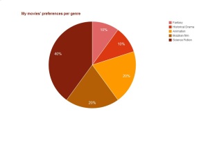
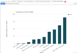
I have selected some of my favorite movies from different genres and nationalities. I was curious to figure out how much each one had cost to be produced. In the case of movie series, I have chosen the one that I like most: Harry Potter and the Half-Blood Prince; Star Wars Episode III: Revenge of the Sith; Back to the Future Part II; Hunger Games: Catching Fire. I also have chosen two Brazilian movies that I admire very much. As I expected, the Brazilian productions had spent very lower budgets than the Hollywood creations, and it is nice to verify this data through visualizations.


Link for google Fusion Tables:
https://www.google.com/fusiontables/DataSource?docid=156_b0bEG8Url9J8yqe3xm5m7bFQlQDOQgBEDECcv
Link for the Spreadsheet:
https://docs.google.com/spreadsheets/d/1PX_0hpj46zaOQBs3ZmVjtjPjk1kJD-1I0h_OpVHIAzc/edit#gid=0