Topic Modeling Results

I first decided to compare the topics of “crime scene”, “writing”, and “crime solving”. In the beginning of the chart, writing spikes significantly in 1893. I wasn’t able to find any major reasons why this happened history wise, but when looking at the date of the publication, I found out that this came from The Adventure of the Reigate Squire. In this story, the main clue that Holmes and Watson find is a torn piece of paper found in the victim’s hand, which (SPOILER ALERT) turned out to be written by the murderers. Crime scene seems to fluctuate until it spikes in 1908. From then to around 1925, it seems to stay pretty constant. I noticed that crime solving seemed to be pretty steady with crime scene, and would increase/decrease at around the same times, which I thought was interesting.   Screen shot 2015-04-02 at 10.41.39 PM

The second set I decided to compare was “light” and “smoking”. I put these two topics together because I thought the words in the light category were words that would be used when lighting a cigar/cigarette. The main thing that I noticed in this chart is whenever one rises/decreases, the other does as well, which makes me think that my first assumption was correct. And when you look from around 1920 on, you can see that although they are at different levels, they increase and decrease in the same pattern.

Screen shot 2015-04-02 at 10.41.53 PM

The third set I compared was “time” and “physical description”. I thought that the two would have some things in common based off of physical descriptions over time. But after doing some research, I unfortunately wasn’t able to find much of anything that would tie these two categories together.

Screen shot 2015-04-02 at 10.42.05 PM

The last categories that I analyzed were “marriage”, “business”, and “travel”. A cool thing I found was when I noticed that business made a huge peak in 1904, and after doing a little research I found out that this was when the telegraph started becoming more popular in common society. I also found that the 1904 World’s Fair occurred during this time, which was a big time for business and introducing new products to the world. Travel peaked in 1908, and I found out that this was when Ford first began making the Model T, which was a widely popular car during this time.

Screen shot 2015-04-02 at 10.42.15 PM

Overall, I thought this assignment was interesting, but when it came to figuring out how these categories compared to things in history I didn’t find it very helpful. I thought the spikes in the charts would lead my research to significant things throughout history but most of the time I couldn’t find anything, which was a little disappointing.

Topic Modeling trends – Using Google Fusion Tables

I have chosen abstract topics, which are not too related to History. Nonetheless, I have observed a thematic connection between them, so I divides them into 4 groups.

The related topics of each group show more appearance at the same time periods, suggesting that Arthur Conan Doyle was writing about related themes in each time. Especial concentrations can be seen between 1891-1893, and 1904-1905. After 1908, the release of stories had been constant till the 1920s.

Chart-1
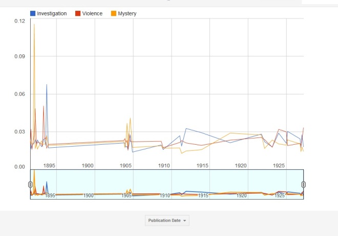
Chart 1: topics 4, 10 and 15 – Investigation, Mystery and Violence

In February 1892, we can see the greatest peak of the whole graph related to the topic “mystery”. This was the release date of The Speckled Band, a story full of words related to mystery, as our class well knows. The peak of “violence” (April 21, 1893), is the release date of The Gloria Scott, a story that ends with a death, which related words are within the “violence” topic. The peak of investigation (September 16, 1893) is related to the story The Greek Interpreter, which involves kidnapping and intimidation, which are material for “investigation”. “Mystery” seems to be the most important topic in the 1904 eight stories, as it stands out from the other topics.


Chart_2
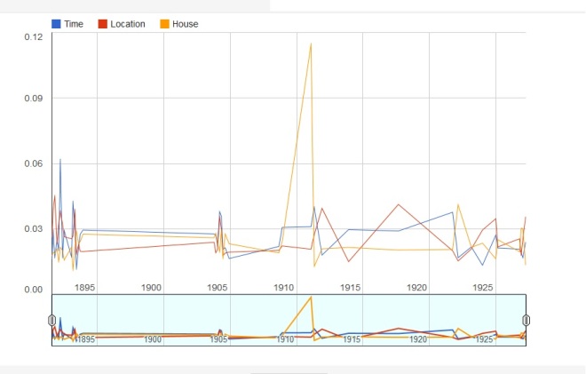
Chart 2: topics 14, 16, 26 – Time, Location, House

The greatest data here are the peaks of “Time”, in March 16, 1892 – release of The Adventure of the Engineer’s Thumb – and “House” in February 1, 1911 – release of “The Disappearance of Lady Frances Carfax”. The first, happens over the summer (time aspect), and the second involves a pursuit along housing environments.


Chart_3
Chart 3: topics 5, 8 and 29 – Conversation, Relationship and Appearance

The principal trends in this graph are a great peak of Relationship in September 1, 1891 (A case of Identity, a story about marriage and the relationship between stepdaugther-stepfather) and a growing appearance of “Conversation” matters in the stories between 1893 and 1903.


Chart_4
I have selected the topic 27 – Sitting – from my 40 topics to the list of the 10 favorite ones.

I have chosen to leave the most different topic one alone in the forth graph. It is “Sitting”, which includes words such as “chair sat room fire bell laid asked lit lamp”.

The first peak is related to the story The Boscombe Valley mystery (October 16, 1891), which involves traveling by train, carriage, driving, actions that might involve terms around “Sitting”. The second peak coincides with The Adventure of Wisteria Lodge (September, 1908), a story that happens inside a house (so it has related terms to “Sitting”).


All the charts in:

https://www.google.com/fusiontables/DataSource?docid=1ufgEjCptMHdlZwv27O3SJHmlyex_8CcmCwR3NSIe

Google Fusion Tables: an easy way to create data visualizations

I have selected some of my favorite movies from different genres and nationalities. I was curious to figure out how much each one had cost to be produced. In the case of movie series, I have chosen the one that I like most: Harry Potter and the Half-Blood Prince; Star Wars Episode III: Revenge of the Sith; Back to the Future Part II; Hunger Games: Catching Fire. I also have chosen two Brazilian movies that I admire very much. As I expected, the Brazilian productions had spent very lower budgets than the Hollywood creations, and it is nice to verify this data through visualizations.

Chart-card
Default Card image.
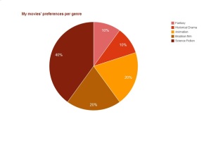
pie-graph
My movies’ preferences per genre.
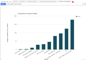
bar-grah-CORRECT
Comparison of movies’ budgets.
Location-studios-2
Location of the studios. It is interesting to observe that most of the continents host one of my favorite movies’ studios.
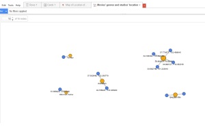
Network-graph
Genres such as Animation and Science Fiction share similar locations.

Link for google Fusion Tables:

https://www.google.com/fusiontables/DataSource?docid=156_b0bEG8Url9J8yqe3xm5m7bFQlQDOQgBEDECcv

Link for the Spreadsheet:

https://docs.google.com/spreadsheets/d/1PX_0hpj46zaOQBs3ZmVjtjPjk1kJD-1I0h_OpVHIAzc/edit#gid=0