For my Google Fusion Tables assignment, I decided to use the software to help compare supercars across the world by country. There are a variety of vehicles in the automotive industry, and surprisingly each country builds there cars very differently.
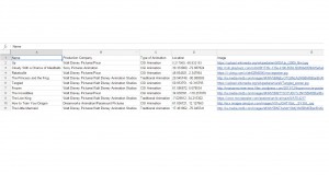
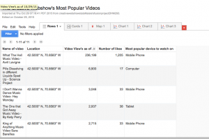
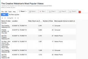
Data Spreadsheet
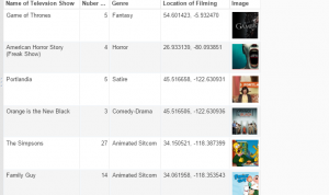
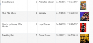
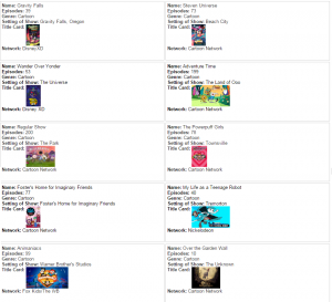
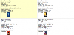
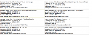
Data Cards


These are the data cards of the supercars I compared for this assignment. The data can also be observed in the spreadsheet link above.
Base Price by Country

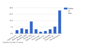
The first comparison I made with my data was comparing the average base price of the supercars (in USD) by country using the vertical bar chart feature. This helps us draw the conclusion that American supercars appear to be the most affordable, while Italian supercars are more expensive.
Horsepower vs. Torque by Country

The second comparison I made was comparing the ratio of average Horsepower vs. Average Torque by country. Most people tend to only consider horsepower when talking about a vehicle’s power, but torque is also very important in acceleration and power, thus the closer the ratio is in comparison to the horsepower, the better. As we can see by the chart (with average horsepower in blue and torque in red) American cars tend to have the closest ratio of horsepower to torque than any other country.
0-60 Acceleration Performance by Country

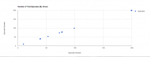
While American supercars might look best on paper, the performance numbers are really what is important to determine which vehicle is superior. In this case, using the line chart feature, we can see that although American cars were less than half the price of other cars and had better horsepower to toque ratios, they were not the best performers in 0-60 acceleration due to other variables.
Pie Chart Network Visualization


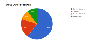
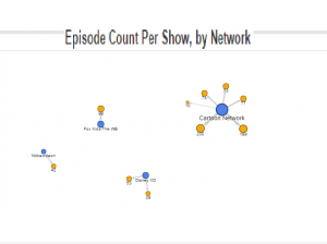
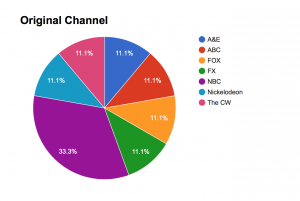
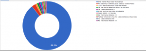
I didn’t find the pie chart or the network visualization tools very helpful for the sake of this project and the particular data I chose. I used the pie chart to display base vehicle prices by country, and network visualization for weight by country.
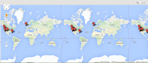
Map

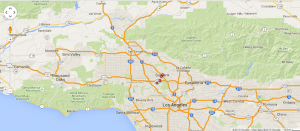
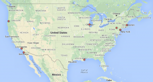
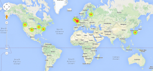
Lastly, the map above shows the locations of the automotive manufacturers mentioned previously.
Overall, I found this project to be very interesting, and my favorite thus far in this class. I love learning about the many intuitive tools Google has to offer, and implementing them using data I found.
The link to my final table can be found here.
