https://www.google.com/fusiontables/DataSource?docid=1jNGQNPrwU-j8oWzP-gU5fKlYIC9CWThhZDruIx29
Google Spreadsheet Info
Cards
map locations of videos
Pie graph
Bar graph
Donut graph
https://www.google.com/fusiontables/DataSource?docid=1jNGQNPrwU-j8oWzP-gU5fKlYIC9CWThhZDruIx29
Google Spreadsheet Info
Cards
map locations of videos
Pie graph
Bar graph
Donut graph
Hi everyone! Welcome to DHM293! 
My Fusion Tables Link and Google Sheets Link
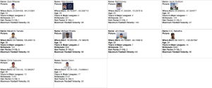
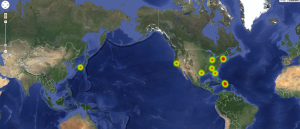
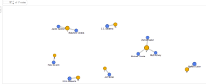
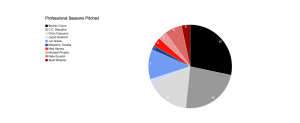
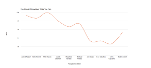
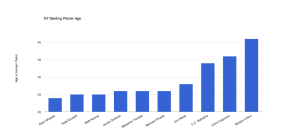
If you made it this far thinking about baseball and numbers, Congratulations! Let’s elect the pitcher with the “Best Hair”:


Here are some sample projects from DHM293 last year:
For my first graph, i used Google Ngrams to visualize the usage of the names of three legendary presidents: George Washington, Thomas Jefferson and Abraham Lincoln. I did so as a way to view the popularity of the presidents during or after their tenures, and to compare their legacies decades after they left office.
Initially, the data seems a bit peculiar because the line representing president Lincoln has a minor spike right by the y-axis. Aside from that, it appears that the largest spike on the entire graph came on president Lincoln’s line during his tenure. It is much larger than the spikes during and after Jefferson and Washington’s tenures, respectively. This is probably due to the rising population of the United States during the 19th century and the increasing number of literate minds. However decades after all of their tenures Lincoln still has a higher percentage of appearances than Jefferson and Washington. Because of this it can be concluded that Lincoln had a larger overall influence on our country, probably because of the obvious social issues happening during his tenure.
My second graph displays the usage of the words baseball, cricket and soccer during the 19th century.
The line for baseball is very reasonable since the sport wasn’t even played professionally until the 1880s. The line for football can also be trusted, but obviously the football being referred to is what Americans now refer to as soccer. The line for cricket cannot be seen as reliable in the realm of sports though, because saying the word cricket could be in reference to the sport or the insect. Therefore to conclude, at the turn of the 20th century it was not clear whether cricket or football (soccer) was the more popular sport, but it is clear that baseball was still relatively unpopular in comparison.
After many thoughts about what to chart and map using the Google Fusion service, I decided to document some of the cities I visited this past summer during my study abroad adventure in Germany. I mapped the various cities and their populations. I was curious to see how many people live within each city after visiting and experiencing them. Each category links to the original charts.
Here is an overview of the ten cities I visited or traveled through. I included the city name, country, an image, and the geographic location with latitude and longitude coordinates.
Below is a physical map that highlights each of the cities.
This pie chart demonstrates the city populations.
This graph also charts city populations ranging from smallest city to largest.
This network visualization shows the relationship between each city and its population.
Erica Gedney
Contending Teams
Contender Locations
Regular Season Win Total Comparison
Berth Origin Comparison
Separates the contenders based on how they are contending, whether it be contending as a division champion, wild card champion or a team still eligible to be a division champion and a wild card champion.
League Comparison
Shows how competitive each league still remains going into the last weekend before the playoffs begin, based on how many teams still haven’t been eliminated.
Link to Google spreadsheet:
https://docs.google.com/spreadsheets/d/12mjxzeJciCtRS9S9_dyzPoYW9S9yk-2T583x0vXTZ7c/edit#gid=0
Link to Google Fusion Table
https://www.google.com/fusiontables/data?docid=1kL3NS9Hk0iZ1T3nd-eORRWfU213tmGGa9i4q9pjT#chartnew:id=6
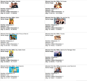
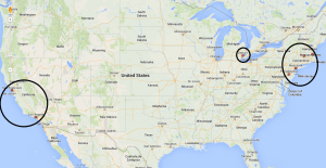
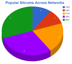
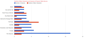
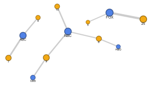
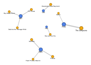
Using Google Fusion Tables, I explored commonalities between 1990s sitcoms because they all followed a similar storytelling formula. Looking at 10 shows, I mapped out the locations of the settings for each show, finding that nearly all of them took place on the east or west coasts. The pie chart reveals the number of shows per network and the bar graph shows its data points comparatively. What’s most interesting to me is the network view. The connections between broadcast/cable network and series is a more visually engaging way of sharing the information. http://wp.me/p4UATe-fk
Before I created my own word cloud, I read the two blog posts regarding this visualization aid, and although one went more in depth about different websites where word clouds can be made, the blog “Word Clouds Considered Harmful” (well, the title says it all) had a very negative attitude toward these fun and light-hearted artistic creations. However, ironically enough, when I was searching for the definition of a word cloud in Google it came up as “An image composed of words used in a particular text or subject, in which the size of each word indicates its frequency or importance.” I found this interesting because in the negative post about word clouds Harris talks about how the size of a certain word should not emphasize the importance of it; but Google seems to think otherwise. Although I do not necessarily agree with Harris, I do believe that before people engage in making word clouds, they should read and understand the text that is being artistically manipulated. With this being said, more people would stray away from using only a word cloud to understand texts, and focus more on comparing their recent finds along with the finds of a visual aid.
Regardless of everyone’s opinions on word clouds and the significance in making them, I actually enjoyed customizing my word cloud for my favorite Sherlock Holmes story, A Scandal in Bohemia. At first I had trouble with Wordle (because of Java) and I decided to try Voyant. However, after seeing what my word cloud looked like with Voyant, I realized I was more of a Wordle fan. When I created my first word cloud with Voyant, many of the words that probably should have been emphasized, were not. For example, Holmes, Adler, and women were not even included in the word cloud. Secondly, I found that a lot of common words had the most emphasis and when I tried to take those out, it didn’t go as planned. Therefore, I tried Wordle again and after downloading Java, I copied and pasted my text and created the word cloud pictured below.
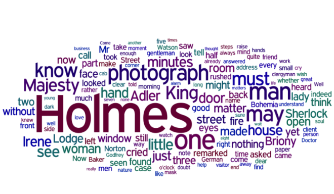
As I played around with Wordle, I found that I enjoyed being able to customize my visualization based on my preferences. As I kept clicking ‘randomize’, I gained insight on what shape I wanted my word cloud to be, the positioning of words, the color scheme, and the font. After it was all said and done, I chose to create my own color palette because I felt like the basic palettes were overused-so why not create my own? When I created my palette I chose dark colors so that words would clearly standout. My colors ranged from different shades of purple, a dark blue, a red wine, and a dark green, just because I found those most appealing. After choosing the specific colors I wanted, I chose to view the different fonts. After viewing various ones, I wound up using a font that made all the words neat and legible.
When I started to analyze my word cloud based on my prior knowledge from reading A Scandal in Bohemia, and understanding what word clouds are used for, I pretty much agreed with the words that mad most emphasis in the word cloud, versus the words that did not. For example, Holmes was obviously the most emphasized because he is a main character not only in this story, but also in all Sherlock Holmes stories (no pun intended). Another word that had emphasis was photograph. As readers know, a major theme in the story is the lost picture and is the main cause of stress for the king or ‘majesty’ (also emphasized), so it makes sense that it is one of the larger words. One thing that I did find interesting was how woman was not emphasized. I understand that ‘woman’ may not have been said a lot in the story, however it is a major representation of what Holmes thinks Adler to be and readers should know of regardless.
What did you all think of word clouds? Yay or nay?
Word Clouds are graphic visualizations of the most frequent words used in a text. This tool allows fresh interpretations to be made about any texts. It provides a unique way of looking at a cluster of frequently used words that may elicit a different understanding of what is being presented.
I chose to closely read The Adventures of Sherlock Holmes: The Blue Carbuncle and create a Word Cloud to develop a new understanding and a fresh perspective on the story. I used Voyant as a tool to generate a Word Cloud for the text.
Below is a Word Cloud for the entire story:
The Blue Carbuncle
After editing the stop words and removing irrelevant words, the most common words to appear in the text are: man, holmes, hat, goose, little, know, stone, bird, and geese (beginning with most frequent word). These words make sense considering the premise of the story involves an investigation of the missing blue carbuncle in the neck of a goose. However I feel that this visualization and understanding of what is most important and valuable in the text would benefit from excluding similar words such as “goose” and “geese” and “bird”. I will edit the stop words to take away “geese” and “bird” and a few other less frequently occurring words that seem to be duplicates in one way or another to see how it strengthens my observation. In the new Word Cloud, there is a stronger sampling of frequent and presumably important words. The most frequent words are: man, holmes, hat, goose, little, know, stone, just, sir, baker, and tell. These words are a little more precise and reveal a lot about the plot of the story.
A quick browse through the word trends shows some information about where words more frequently appear in the text. The most frequently occurring word “man” appears scattered throughout the text in an even fashion. This makes sense since it is such a generic word. The top three words used commonly at the beginning of the text are: hat, goose, and stone. The top three words used more towards the end of the text are: holmes, little, and know. If I had no prior knowledge of the story I would analyze this information as a story starting out confidently and ending up a mystery. There seems to be a clear understanding with these frequent words that the beginning of the story is set up in such a way that is confident and outlining the premise. There are strong nouns that identify the main points and symbols of the story. It highlights what is most important. As the story progresses there are mysterious things happening. A case is being investigated by Holmes. The frequently used words that appear more often towards the end of the story are Holmes (noun), little (adjective), and know (verb). Holmes is solving the mystery of the Blue Carbuncle so naturally one would expect his name to appear at the end or resolution of the story. Interpreting the words as “Holmes knowing little” is another angle that could be looked at. Even though he does solve the case, the majority of the story is all about clues and small bits of information that are used as a collective whole to solve a mystery. These words and their placement in the text may be valuable in understanding the key points and themes of the story.
Using the Word Cloud platform and Voyant tool to analyze a Sherlock Holmes story is a fun and interactive way to read and understand the text. Being able to control what words should or should not appear in the Word Cloud, viewing the word trends, and seeing the frequencies are all helpful and can be used to extract important symbols or themes in the text that may have otherwise gone unnoticed.
Erica Gedney