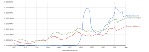
For my first graph, i used Google Ngrams to visualize the usage of the names of three legendary presidents: George Washington, Thomas Jefferson and Abraham Lincoln. I did so as a way to view the popularity of the presidents during or after their tenures, and to compare their legacies decades after they left office.
Initially, the data seems a bit peculiar because the line representing president Lincoln has a minor spike right by the y-axis. Aside from that, it appears that the largest spike on the entire graph came on president Lincoln’s line during his tenure. It is much larger than the spikes during and after Jefferson and Washington’s tenures, respectively. This is probably due to the rising population of the United States during the 19th century and the increasing number of literate minds. However decades after all of their tenures Lincoln still has a higher percentage of appearances than Jefferson and Washington. Because of this it can be concluded that Lincoln had a larger overall influence on our country, probably because of the obvious social issues happening during his tenure.
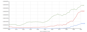
My second graph displays the usage of the words baseball, cricket and soccer during the 19th century.
The line for baseball is very reasonable since the sport wasn’t even played professionally until the 1880s. The line for football can also be trusted, but obviously the football being referred to is what Americans now refer to as soccer. The line for cricket cannot be seen as reliable in the realm of sports though, because saying the word cricket could be in reference to the sport or the insect. Therefore to conclude, at the turn of the 20th century it was not clear whether cricket or football (soccer) was the more popular sport, but it is clear that baseball was still relatively unpopular in comparison.

