Cruisin’ Regent Street

Screen Shot 2015-04-09 at 2.14.49 PM
Regent Street today, specifically the curved part heading towards Piccadilly Circus

I was tasked with looking into Regent Street in London, which is mentioned in A Scandal in Bohemia. Here is the passage from the story that mentions Regent Street, and it entails Holmes describing Irene Adlers’ future husband:

 “He was in the house about half an hour, and I could catch glimpses of him in the windows of the sitting-room, pacing up and down, talking excitedly, and waving his arms. Of her I could see nothing. Presently he emerged, looking even more flurried than before. As he stepped up to the cab, he pulled a gold watch from his pocket and looked at it earnestly, ‘Drive like the devil,’ he shouted, ‘first to Gross & Hankey’s in Regent Street, and then to the Church of St. Monica in the Edgeware Road. Half a guinea if you do it in twenty minutes!’

According to the Conan Doyle Encyclopedia, Gross & Hankey’s was probably a jewelry shop, although it was fictitious. Mr. Norton hurried there before going to the church to secure the wedding bands. After researching the Regent Street area, I focused on the section of the street that curves, heading into Piccadilly Circus. Today, this is a very upscale shopping district, and there is an Underground station at Piccadilly Circus. (Note: In this context, a circus, from the Latin word meaning “circle”, is a round open space at a street junction)

Screen Shot 2015-04-08 at 4.03.15 PM
Victorian Google Map of the Regent Street and Piccadilly Circus area
Screen Shot 2015-04-08 at 4.04.20 PM
Current Google Map of Regent Street leading into Piccadilly Circus. Note several upscale shops on Regent in this area today.
Screen Shot 2015-04-09 at 1.07.30 PM
Using http://www.locatinglondon.org, a 1746 map shows Piccadilly, but Regent Street doesn’t exist yet. “The Hay Market” on the right corresponds to the lower part of the future Regent Street.

Although the jewelry shop was fictional, Booths’ map shows red and yellow which indicate the upper end of income. It can be established that the Regent Street/Piccadilly Circus area has been wealthy for over a century, at least.

Screen Shot 2015-04-08 at 4.10.28 PM
Charles Booth Map of Regent by Piccadilly Circus

Finally, British History Online provides an even deeper glimpse into the history of Regent Street. This website reinforced the facts that I already knew; the commercial aspects and the wealth of the area were well established. However, I also discovered when Regent Street was designed and built (1813), why it was named as it was, and the architect behind the buildings (John Nash).

The long vista of Regent Street, as seen from the Quadrant, is very fine, exhibiting, as it does, a remarkable variety of architectural features. It was erected principally from the designs of Mr. John Nash, who deserves to be remembered as the author of this great metropolitan improvement; and it was named from the architect’s patron, the PrinceRegent. The expenditure of the Office of Woods and Forests in its construction was a little in excess of a million and a half. Of course, being a thoroughfare of so recent a date, having been commenced in 1813, Regent Street has scarcely a back history for us to record here, like Pall Mall and St. James’s Street. It belongs to “new,” and not to “old” London.

In his design for Regent Street, Nash adopted the idea of uniting several dwellings into a façade, so as to preserve a degree of continuity essential to architectural importance; and it cannot be denied that he has produced a varied succession of architectural scenery, the effect of which is picturesque and imposing, superior to that of any other portion of the then existing metropolis, and far preferable to the naked brick walls at that time universally forming the sides of our streets.

Word Cloud Assignment_DeFranco

Screen shot 2015-03-02 at 10.15.16 PMThe first word cloud tool I used was Voyant. I liked this site because it let me customize how I wanted my word cloud to look down the the word. I like that there were adjustable settings that gave you the chance to decide what you want to emphasize and what you want to be smaller or even not show up at all. This would be a good tool for a company that wanted to use interesting graphics to further a brand or for name recognition. It is colorful and dynamic and lets you include an unlimited amount of text and chooses the most common words but lets you call the shots afterwards. I do wish, however that there were more design customization options. I would like to chose the colors to match the theme I’m working with. For example I might make this particular word cloud grey 50 shades of grey (no pun intended) because black and white alludes to the time period.

Screen shot 2015-03-02 at 10.50.58 PMI have to say that I had a really hard time getting either of the two programs to work on my computer. They both required me to install additional programs on my laptop that when I tried to, completely froze up everything to the point where I had to manually restart my computer. Twice. And I fought with there programs for almost an hour. So rather than risking breaking my laptop I’m supplementing another word cloud program that I learned because it’s the one we use for our campus’s online alternative magazine, The Little Rebellion, for which I am a contributing editor. It’s quick, simple, and very user friendly. Again there are not many customization tools but it makes a clean rectangular image and you can customize the font with any typeface from the Microsoft Word suite.  We use these word clouds as backgrounds for other things–lower the opacity and there ya go.

Head In The Word Clouds, Feet On The Ground


Story: Scandal In Bohemia

Overall, I thought that the word cloud project was an interesting experience for sure. After listening to our guest speaker go over how the aesthetics of a data platform can truly effect how it’s absorbed by the audience, I was eager to delve into it. However, once I got into it I came to the conclusion that they aren’t really that informative. If you’ve already read the story, then of course it’s going to reinforce the common themes present in the readings! Despite my thoughts on this, I did like the design factor of the project and hope that we can do more of that this semester!

 Here is my first word cloud, from Voyant. Overall, I thought that it turned out well. But the program was not very user-friendly. It appeared that it needed to be updated. I wasn’t sure if there was a way to change the colors, shapes, or alignment of the words because it was confusing to use. Also, the jargon used like “corpus” was outdated and I wasn’t sure what it even meant.

 Screen Shot 2015-03-02 at 10.14.52 PM

In terms of the words present, I wasn’t really surprised at all which were the most popular.I feel as if the largest word in all of our projects is going to be Holmes. 

The same can be said for the following word cloud, from Wordle.


Screen Shot 2015-03-02 at 9.56.45 PM


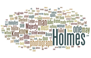
I really liked using this tool a lot more because it was very straight-forward. User friendly programs are a huge plus in a project like this! As I just said, the words that appeared didn’t really surprise me all that much, either. Both of my word clouds are pretty similar, I think. King and photograph are two of the larger words up there, and as we know from reading the story, those are two important themes.

In part of this assignment, we also had to read two articles. I thought that the second one was pretty comical, and at the same time, agreeable. Because I’m a journalism student, I saw exactly where the author was coming from in terms of how a word cloud sometimes doesn’t illustrate the substance of a story at all. In journalistic writing, we actually avoid using similar words if we possibly can, unless it is the proper title of document, a study, a group, the name of a person, etc. We try to use synonyms as much as we can to crack any monotony in the bud and make our writing more colorful and appealing. In short, there’s probably close to 10 different words that can be swapped out throughout a story that essentially mean the same thing.

“Prettiness is a bonus; if it obliterates the ability to read the story of the visualization, it’s not worth adding some wild new visualization style or strange interface.”

In fiction works, such as a Holmes story, I noticed that word clouds are totally useful in illustrating some of the main concepts that are present. I think that analyzing word usage this way definitely has its benefits, but the analysis can’t end there. One of the larger duties in analyzing text is being able to identify what these themes actually mean. I do not think, however, that word clouds can substitute the true analytical thinking needed to process what these themes mean in the grand scheme of the plot. The initial thought of the word clouds is cool, but I think that there may be better tools out there to successfully show the themes of the story that looks more into substance and not just the word count.