https://www.google.com/fusiontables/DataSource?docid=1jNGQNPrwU-j8oWzP-gU5fKlYIC9CWThhZDruIx29
Google Spreadsheet Info


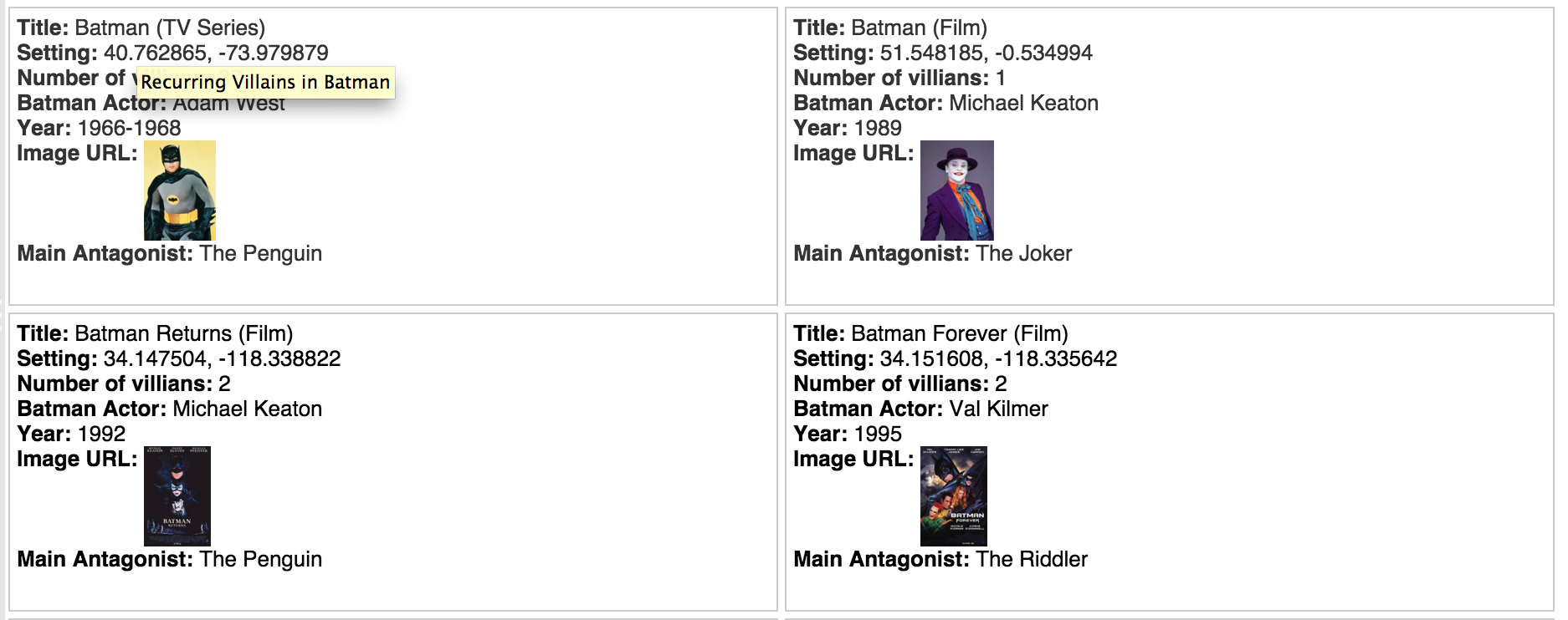
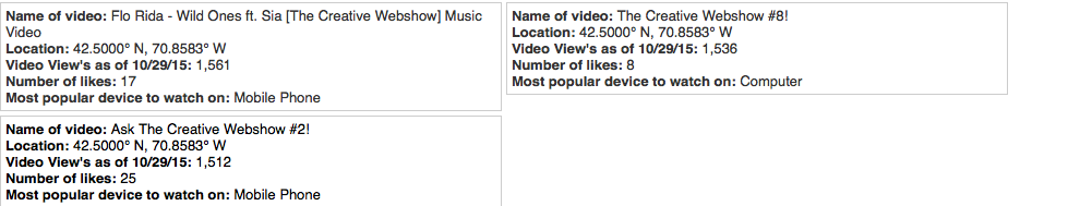
Cards

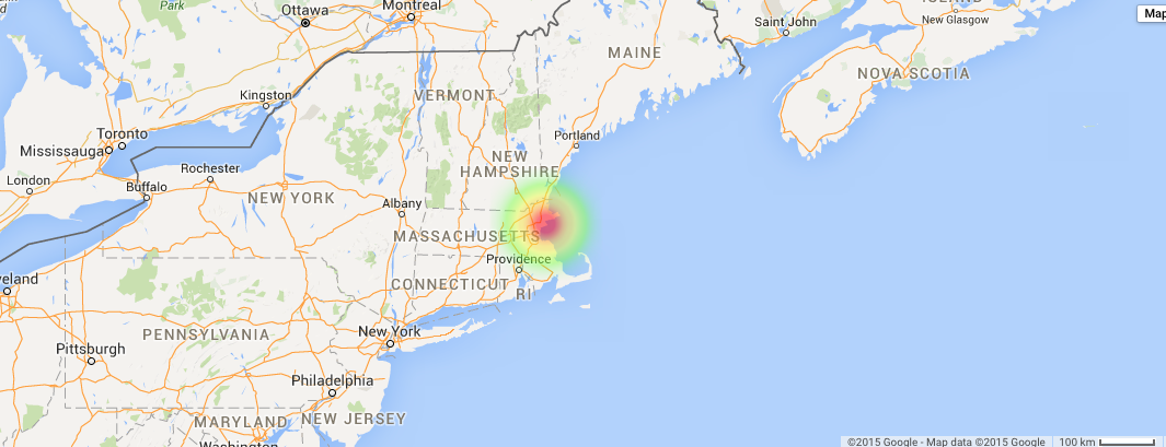
map locations of videos

Pie graph
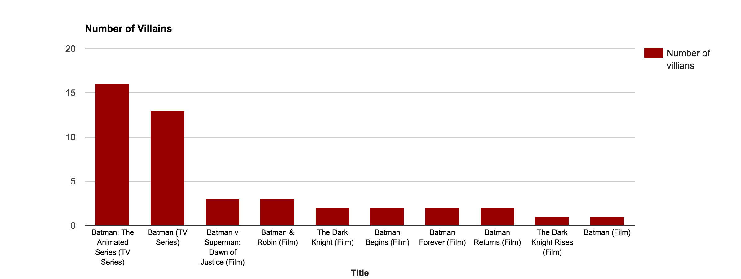
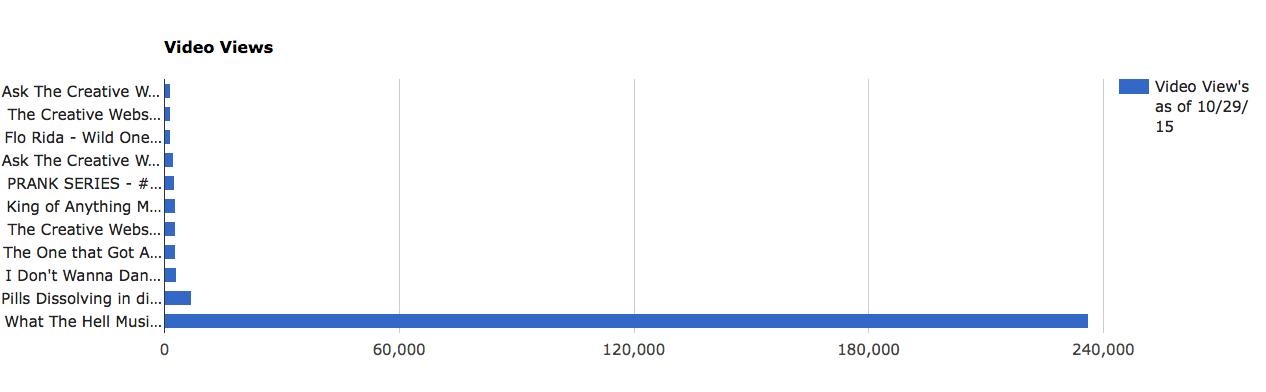
Bar graph
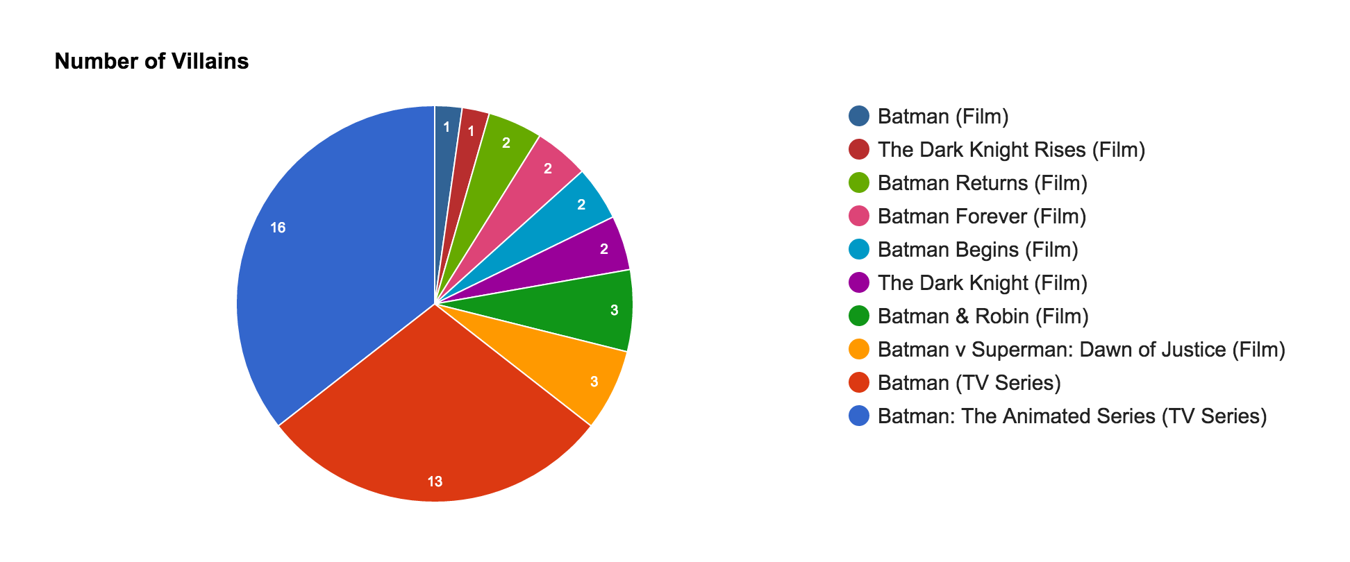
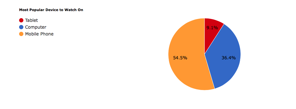
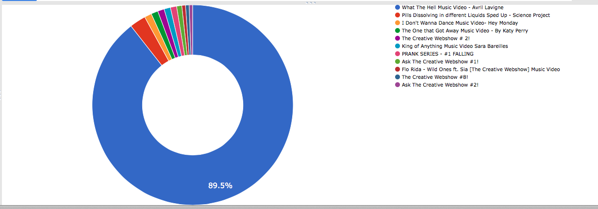
Donut graph
https://www.google.com/fusiontables/DataSource?docid=1jNGQNPrwU-j8oWzP-gU5fKlYIC9CWThhZDruIx29
Google Spreadsheet Info
Cards
map locations of videos
Pie graph
Bar graph
Donut graph
Digital Humanities is an exciting new field that allows people to make really interesting projects in the field of humanities. The possibilities of what you can do are endless, which is why I loved doing several projects and learning a few things about different tools. When you create a project however, I have learned these five important qualities a project should have in order to make it as best as it can be.
1) Your objective should be clear.
What is the purpose of this project? Before you even begin, you should be able to answer this question. This is very important because you need to know what you are trying to achieve. For my Google Ngrams project, my objective was to show the usage of “Evolution” and “Charles Darwin” during the Victorian Age, as well as demonstrate the different options that will affect your results when changing some of the options, and case-sensitivity. This was the purpose of this project.
2) Your information should be accurate and relevant.
Oops, I just remembered that during my Google Fusion Tables project I got a little off track (but that’s serves as a congratulatory for scrolling through all the photos) for posting a picture of a husky puppy, but the rest of the information is clear and accurate. The information about the vehicles on this long list (wasn’t too tedious) are describing what they are and their performance in terms of sales, which has been sourced from reliable websites to ensure accuracy. That way, it’ll make your project much more informative and it’ll make sense to the average reader who wants to learn a thing or two from it.
3) Design should be just right.
This is a little tricky, a boring design will make a project very uninteresting but if you go overboard with the colors and themes, than people will get distracted by the all the “shiny” bits and possibly not take the project seriously. With my word cloud project, the key is to try to aim for that “sweet spot” where your project is just the right design so it can be clearly read and nice to look at. The swan shaped word cloud from my word cloud project is in a cute swan shape and has several nice shades of blue to grab the reader’s attention, but is still in an easy to read font so the words are not hard to read. Did that word cloud hit the sweet spot? I think so.
4) It should be user-friendly.
I think this is very important, you really don’t want to frustrate the user don’t you? Good, so don’t be the creator of this site. Anyways back to the word cloud project, there were three sites that we were able to use to make the word clouds. I have used Tagxedo and Wordle. The one I didn’t use was Voyant. Tagxedo wasn’t the most user friendly but had great options for making word clouds. Wordle was very simple to use but limiting and Voyant was nearly the same as Wordle, but the opposite with most options. Basically, the user should not have to Google how to use ______ to use a project or software, in this day and age, most people should have this figured out.
5) Have fun!
No seriously, I mean it, is it really a bad thing if you don’t have fun while doing a project? Think about it, you’ll learn so much while doing your projects like I have with my Ngrams. When I noticed some trends with my results, I was able to learn a lot about Charles Darwin and Evolution during the time period that I saw an increase in the usage of this word. Plus when Darwin’s Theory of Evolution started to gain traction, I noticed that its usage has increased a lot, and you can also see why this is the case. Plus with my Fusion Tables, I loved doing research of the best selling cars of 2014 and seeing what cars Americans want and also learning why this is the case.
So how does DH let scholars ask new questions?
Many DH projects are shared freely and allow everyone to contribute. People will learn a lot from these projects and they will therefore think and perhaps question what they know. Since people usually collaborate on these projects, they will bring new perspectives to the table and ask questions about things that some people wouldn’t have known if they haven’t seen history or information in that new perspective.
After performing last week’s topic modeling on all 56 Sherlock Holmes short stories, 10 out of the 100 topics generated from last week were put into Google’s Fusion Tables to check for trends in the 10 particular topics of our choice. I chose to mainly look at the time period from January 1892 to July 1893 being that it contained a high concentration of published Sherlock Holmes stories.
The first two topics I looked at and compared were,

https://www.google.com/fusiontables/data?docid=1nQCcpLRRsesXRw9SnXVKGJQTQBgQ2JQ1ZHxsAYf-#card:id=2


Sorry this post has so many photos, so I’ll make up to you all by posting this adorable husky.

My Fusion Tables Link and Google Sheets Link


If you made it this far thinking about baseball and numbers, Congratulations! Let’s elect the pitcher with the “Best Hair”:

I looked at the top 20 Twitter accounts with the most followers and chose ten of them [mostly because I wanted Ellen Degeneres on my list and she wasn’t in the top ten, but also because the YouTube and Instagram accounts were in the top ten and I didn’t think they would be as interesting to track] for this project. I recorded each person’s name, picture, occupation, their follower count [as of Thursday], the number of years they have had their accounts, and what city they live in primarily. Each label is a link to the original chart in Google Fusion Tables.

Map:
Shows which city each celebrity spends most of their time.

Shows how many years these ten celebrities have had their Twitter accounts.

Shows the occupations of the different popular Twitter accounts.

This chart shows the names of the celebrities related to the number of years they have had their Twitter accounts.

-Brooke Chapman
View my “Favorite TV Shows” spreadsheet here!
Card images:

Map of each show’s setting:

Bar Graph showing average number of seasons per genre, and the max/min:

Pie Chart showing the percentages of different genres:

Network Visualization showing the TV shows names and genres: