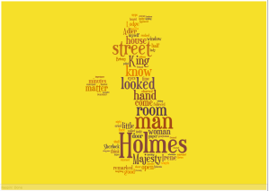
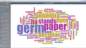
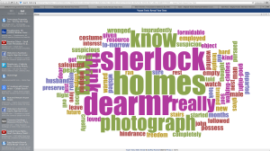
For this project, I decided to make some word clouds based off of the Sherlock Holmes story A Case of Identity. I thought that this project was a fun experience, and it’s definitely something that I’ll try using again. After listening to our guest speaker last class talk about graphic design and how to make our digital projects look more visually pleasing, I was excited to jump into this project. I first decided to make a word cloud using Voyant (as shown below).
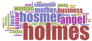 I was hoping that when I submitted my story, it would automatically turn out like this, but I had to make a few tweaks with the stop words before I got to this final result that I think turned out pretty well. I think that it emphasizes many of the core themes and major words that you need to know in order to get at least some idea of what the story is about. I don’t think this type of chart in general is the most easy to understand, but it’s visually appealing with the fun colors and the simple font. I also really liked how user-friendly the site was, and it wasn’t hard to make edits to it.
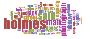
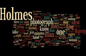
Unfortunately, my ancient computer couldn’t handle any Java or Silverlight updates, so I wasn’t able to use Wordle or Tagxedo. I’m still kinda bummed because I looked at the word clouds that other people posted and they look really cool. But I was informed of another word cloud website called JasonDavies.com (as shown below)
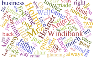 This word cloud is a lot more cluttered than the one from Voyant and I didn’t really enjoy using it. It only lets you change the font, which is a bit restricting when trying to make something look more visually appealing. And after using Voyant, it was a bit disappointing not being able to change anything other than the font. Most of the words are around the same size, so you can’t really tell which words are the most important. If someone who had never read the story before looked at this word cloud, I don’t think they would have a clue what the story was about.



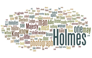
 es. Not much of a surprise there. An interesting things was the addition of last names. Holmes obviously being the biggest since he is the most important character smaller names also provide detail and allows the viewer to see which characters are of utmost importance and which are subsequently less important. The word “typewritten” appeared six times throughout the story and for a second I wondered why, six seemed like quite a lot. Then I remembered that is exactly how Holmes solved the case in the end. Once clicking on the word “typewritten” I saw the pattern where it was mentioned here and there starting in the middle and then one last time at the end signifying he had solved the case.