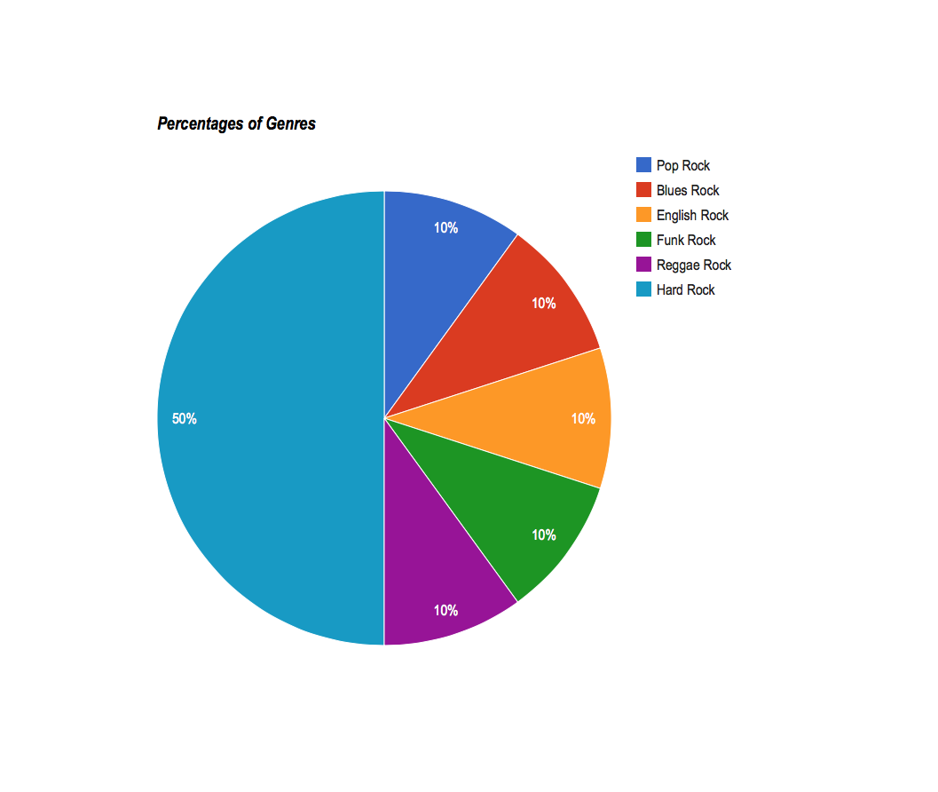
Using Google Fusion Tables, I explored commonalities between 1990s sitcoms because they all followed a similar storytelling formula. Looking at 10 shows, I mapped out the locations of the settings for each show, finding that nearly all of them took place on the east or west coasts. The pie chart reveals the number of shows per network and the bar graph shows its data points comparatively. What’s most interesting to me is the network view. The connections between broadcast/cable network and series is a more visually engaging way of sharing the information. http://wp.me/p4UATe-fk
Data CardsWhere in the world were these shows taking place?Number of Shows per NetworkA Look at Number of Seasons in a Series and Number of Main CharactersConnections Between Network and # of SeasonsNetwork View (Literally) of Series’
Members of the 1997/1998 New York YankeesHometowns of the 1997/1998 YankeesBatting Averages: 1997 vs. 1998Pie Chart: % of Right-Handed, Left-Handed, and Switch HittersPie Chart: Player Contribution to Total BA (1997)Pie Chart: Player Contribution to Total BA (1998)Groupings of Right-Handed, Left-Handed, and Switch Hitters
You can find interactive versions of these visualizations here, and my spreadsheet can be found here. (I added the “Genre” section after I made the spreadsheet directly into Google Labs)
The card set for my data (both of the above)The map from my dataThe bar chart from my data, which shows the amount of main characters in relation to what movies they are from.My network visualization, which shows the genres of the movies and how they are connectedA bar chart, which shows the amount of main characters over the years of the movies being made.
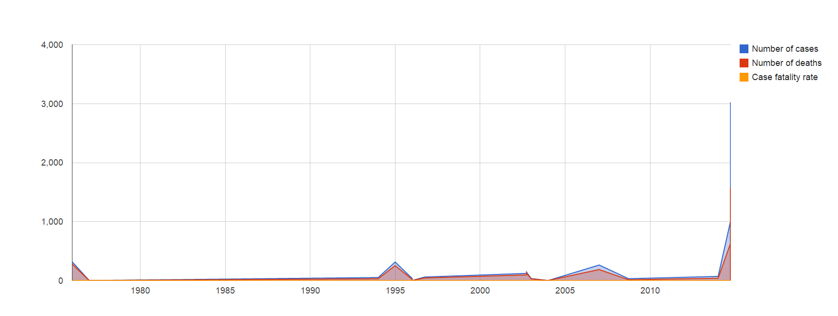
In late 2013, when the first cases of Ebola started popping up in the DRC, it was not generally thought to get very large. Historically, Ebola outbreaks (including the various subspecies, such as Sudanvirus) infect no more than 400 people at their worst, and burn out rather quickly (as is the nature of the disease). However, here we are, almost a year later, with a looming health crisis that may very well wreak untold damage on the people, economy, and society, of Africa as a whole.
To frame the outbreak, I have gathered data from Wikipedia, the CDC and the WHO’s webpages. Using this, I’ve attempted to construct a Google Fusion table readout of what the ongoing outbreak looks like in comparison to other historic outbreaks of this strain- which, for those who did not know, is what was formerly known as Ebola Zaire (or, ZEBOV), but is now just “Ebola”.
The current species was the very first one found, back in 1976. It’s unknown if this strain is a familiar one that has just become successful due to proper circumstances, or if it’s a new breed that is somehow more effectively spreading than its kin. Regardless, more patients have been infected in the current outbreak than had ever been in the 38 years of the disease’s documented existence prior.
With any luck, effective quarantine will contain the disease long enough for it to either burn out, or buy us time to vaccinate and strangle it to death. Either way, this will be regarded as one of the largest and deadliest viral outbreaks in the history of mankind. Halting its spread means effective quarantine, improved logistic support for aid services in the area, and education of the population as to hygiene. Unfortunately, due to preexisting cultural conceptions and a distrust of Westerners, these efforts are hard to implement and, so far, have failed to make a real dent in problem areas such as Liberia (which has the largest number of infected, by far).
For full access to the table and all information, please click here.
Cases by year.A full card readout of historical ZEBOV outbreaks.A heatmap showing the vast majority of ZEBOV outbreaks since 1976 (not pictured is Russia’s anomalous lab incident). Courtesy of Google Maps.A bar graph showing an increase in infection rates, mortality and CFR as time goes on. As the sample size for the virus increases (IE more are infected), the true nature of the virus becomes apparent.A network graph demonstrating infected by nation (for all outbreaks).A pie chart showing the share of infection cases by nation. It’s immediately apparent which nation has been hit the most severely- in Ebola’s first break in Liberia this year, it’s already infected (and claimed more lives) than have ever been even exposed beforehand.