Google Fusion Tables: A Comparison Between My Favorite Bands and Their Success

Here’s a link to my Google Fusion Table

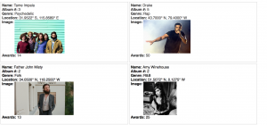
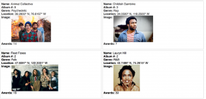
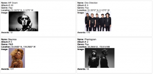
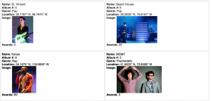
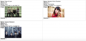
Default Cards

Screen Shot 2015-11-02 at 7.00.42 PM Screen Shot 2015-11-02 at 7.00.50 PM Screen Shot 2015-11-02 at 7.00.59 PMScreen Shot 2015-11-02 at 7.01.08 PM Screen Shot 2015-11-02 at 7.01.16 PM

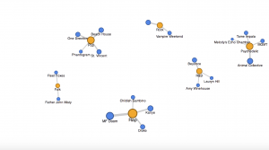
Network Visualization 

This shows the connection between artist and genre weighting them by how many albums I have in my iTunes library, showing what genres are most influential to me. (I don’t know why the one bubble in Rock doesn’t label Kings of Leon as the artist).

Screen Shot 2015-11-02 at 7.05.16 PM


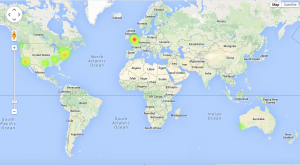
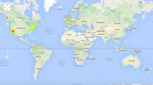
Maps

Weighted by Number of Albums (in my iTunes)

Screen Shot 2015-11-02 at 7.20.15 PM

Weighted by Number of Awards

Screen Shot 2015-11-02 at 7.22.42 PM

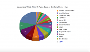
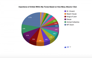
Pie Chart

(Continued because the list of artists didn’t fit the page)

Screen Shot 2015-11-02 at 7.33.17 PM Screen Shot 2015-11-02 at 7.34.44 PM


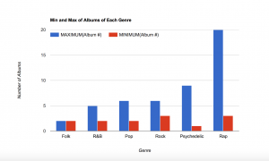
Bar Chart

Screen Shot 2015-11-02 at 7.48.49 PM