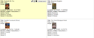
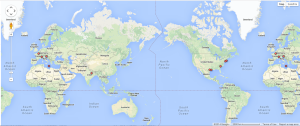
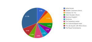
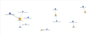
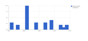
You can find interactive versions of these visualizations here, and my spreadsheet can be found here. (I added the “Genre” section after I made the spreadsheet directly into Google Labs)
~ Austin Carpentieri
You can find interactive versions of these visualizations here, and my spreadsheet can be found here. (I added the “Genre” section after I made the spreadsheet directly into Google Labs)


~ Austin Carpentieri