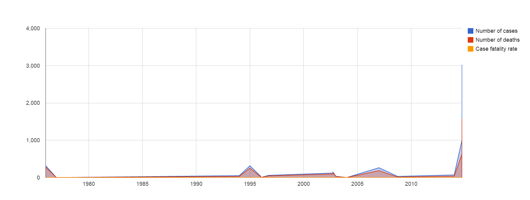
In late 2013, when the first cases of Ebola started popping up in the DRC, it was not generally thought to get very large. Historically, Ebola outbreaks (including the various subspecies, such as Sudanvirus) infect no more than 400 people at their worst, and burn out rather quickly (as is the nature of the disease). However, here we are, almost a year later, with a looming health crisis that may very well wreak untold damage on the people, economy, and society, of Africa as a whole.
To frame the outbreak, I have gathered data from Wikipedia, the CDC and the WHO’s webpages. Using this, I’ve attempted to construct a Google Fusion table readout of what the ongoing outbreak looks like in comparison to other historic outbreaks of this strain- which, for those who did not know, is what was formerly known as Ebola Zaire (or, ZEBOV), but is now just “Ebola”.
The current species was the very first one found, back in 1976. It’s unknown if this strain is a familiar one that has just become successful due to proper circumstances, or if it’s a new breed that is somehow more effectively spreading than its kin. Regardless, more patients have been infected in the current outbreak than had ever been in the 38 years of the disease’s documented existence prior.
You can see for yourself the numbers by following this link.
With any luck, effective quarantine will contain the disease long enough for it to either burn out, or buy us time to vaccinate and strangle it to death. Either way, this will be regarded as one of the largest and deadliest viral outbreaks in the history of mankind. Halting its spread means effective quarantine, improved logistic support for aid services in the area, and education of the population as to hygiene. Unfortunately, due to preexisting cultural conceptions and a distrust of Westerners, these efforts are hard to implement and, so far, have failed to make a real dent in problem areas such as Liberia (which has the largest number of infected, by far).
For full access to the table and all information, please click here.