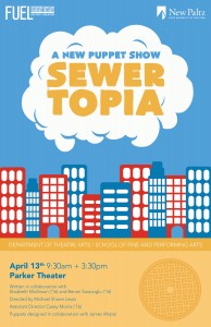
I used bright primary colors to address the target audience. These colors make my design cheerful, which is the intention.

I originally began with using this orange cone. It was hard to choose between these two designs, but the text is easier to read and has better placement in my first design. Also, the orange cone does not seem to be a very recognizable image and does not directly relate to sewers.
My name is Sarah Weiss. I am a sophomore and studying graphic design at New Paltz. I will graduate in the spring of 2018.
2 Responses to “Sarah Weiss”
Such a fascinating article on a lovely day like today; thank you for your efforts in creating such a beneficial article. mygreatlakes
Bloodmoney looks like a lovely pastel clicker game at first glance. A terrifying offer lurks beneath the fluffy colors, though: $1 for each click, regardless of price. To what extent would you have to suffer in order to survive?