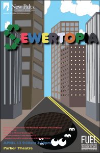
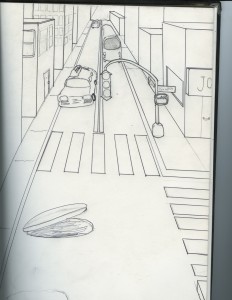
When I creating my Poster I initially thought of a cityscape theme. I tried to incorporate the whole idea of an urban area while exposing a semi-opened sewer cap to catch the viewers attention. At first my sketch put more emphasis on the city itself. I still kept the same idea, but put the focus more on the sewer. The letter “s” was transformed to represent the recycle symbol to get a positive message across to the viewer. Lastly, I tried to decorate the overall poster with attractive coloration to catch the age groups attention.


2 Responses to “Michael Calvente Sewertopia”
Wow, this article is very helpful in living this mortal daily life. Oh yes, what did you think when you made this article. Thanks for peace
Your content is very interesting. I am very impressed with your post. I hope to receive more great posts.John Luther Coat