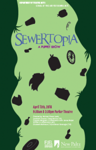
I sought to address the audience by designing this through a lens that references an “Alice down the Rabbit hole look” that would specifically target a younger audience without being too scary. I really wanted the viewer to look throughout the movement of the poster as well. I think the colors can also attract children and adults. My process started with that theme and then I looked into pictures of trash to create silhouettes to include in the sewer. I then decided to choose color schemes that were whimsical and looked like a sewer. For the second design I varied away from the more sewer look and just included the opening of the man hole. I have a few variations of the 2nd design with color choices and including the little boy looking from the opening to the sewer.
About me: My name is Victoria Falco and I’m currently a Sophomore in the BFA Graphic Design program. My interests lay in advertising, book, packaging, magazine, and poster design.
3 Responses to “Sewertopia Poster”
great article thanks for sharing it
Trang web và ứng dụng của 23WIN được thiết kế với giao diện bắt mắt, thao tác dễ dàng và tương thích với mọi thiết bị. Người chơi có thể tham gia mọi lúc, mọi nơi mà không lo gián đoạn. 23win
The game’s momentum builds fast, Slope Game giving you only seconds to react to curves, drops, and barriers that appear with increasingly unforgiving frequency.