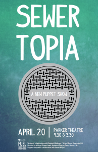
Since this puppet show is aimed towards young children, I wanted to create something that would appeal to both kids and their parents, since the parents would be the ones ultimately making the decision to attend the show. I kept the colors fairly neutral in order to attract all types of audiences, and left a good amount of white space so that the overall appearance would be clean and the message could be communicated clearly.
My process consisted mostly of research. I found that minimalistic posters were most interesting because they were more ambigious, and left the interpretation up to the viewer, allowing their imagination to fill in the blanks.
My name is Taylor Birchmore and I am currently a junior in the Graphic Design BFA program. I am most interested in print and logo design, but I am also interested in web design and typography as well.
