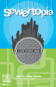
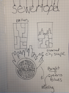
 For my poster design, I wanted to create a poster that had a theatrical feel to it. I wanted it to be graphic and inviting to children. One thing that I wanted to surely include was the aspect of strings to highlight the puppet nature. I decided to cut the composition in half but representing above and below the sewer. Above the sewer is a bright blue city and below the sewer is the winding sewer pipes. Below are my sketches and first digital iteration.
My name is Rebecca Feldman and I am a sophomore in the graphic design BFA program. My expected graduation date is May 2018. I enjoy poster design and had a fun yet challenging time during this project.


One Response to “Sewertopia Posters”
Thank you for sharing this amazing piece of content. You are doing a great job, thanks for it.German Trench Coat