Tara DuNaier

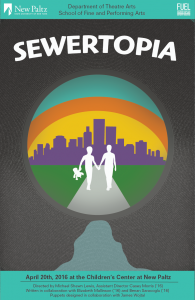
- I sought to address the children viewing the poster through bright colors and an interesting scene, and to address their parents through the sewer imagery and the easily-read information on the top and bottom of the poster.
- I began with sketches of two people walking towards a city and developed the poster from there, moving it into illustrator and taking a comment made by our client about a light at the end of the tunnel and sewer imagery capturing people’s attention to inspire the sewer border around the city. The poster progressed from a very flat and boring poster to a bright informational poster with depth.
- Arthur Hoener was incredibly helpful with this project, directing me to use brighter happier imagery than what I had and helping me with different techniques to display my vision.

One Response to “Tara DuNaier”
Royaledle is more than just a game—it’s a brain workout! In Clash Royale, demonstrate your skills by solving difficult puzzles and defeating the inventor. Every accomplishment seems like a victory, and every assumption seems like a small victory.