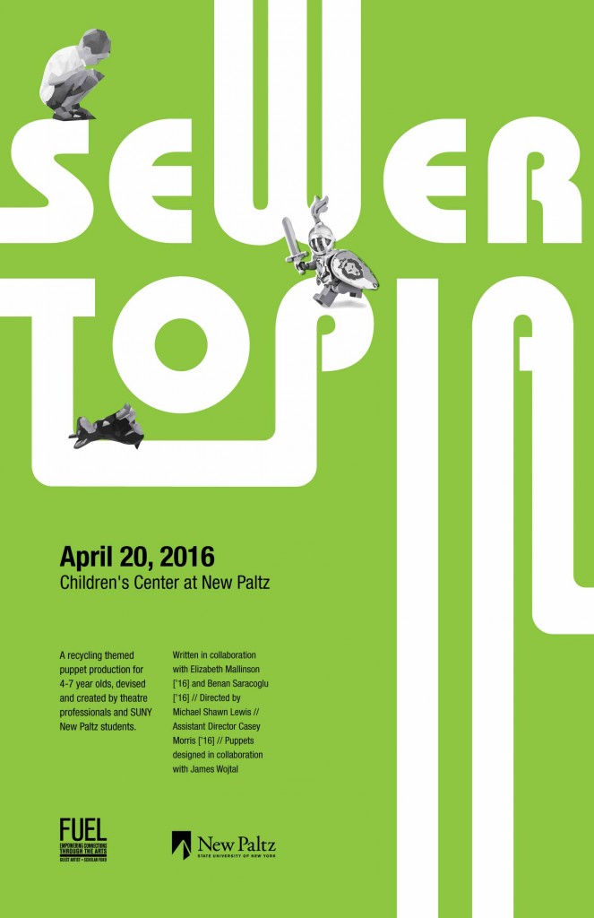
I sought to address the target audience with the use of bright color. I created a series of posters in eye catching colors that would stand out to children. I am not confident in my illustration skills, so I chose a typographic approach. The curved edges and extended characters are supposed to be reminiscent of a sewer system. I chose to include imagery of the three main characters – the boy, the knight, and the dog – to hint at the narrative. I created a series of posters in three different colors because I felt the variety would be a playful touch.
I began by sketching my ideas out on paper, and exploring ways to make the type connect like a sewer system. I ended up finding a typeface that suited my needs and modifying it. I did photo research to find my images and traced them in illustrator to give them a playful poly effect. Finally, I chose the information to include on the poster and organized it accordingly.
My name is Anja Kerkapoly and I am a junior in the graphic design program at New Paltz. I will graduate in May 2017.


12 Responses to “Kerkapoly | Sewertopia”
I really like the way that you have expressed yourself. There is a lot to be admired from this post. You might want to click onGold 49ers Jacket
“Thank you designed for ad the following, It’s quickly what precisely As i seemed to be looking for for the purpose of upon yahoo. I’d quite a lot reasonably pick up viewpoints at a individual, a bit when compared with a business web page, that’s the reason I really like web logs for that reason a lot. Bless you!”
Pure Cotton Bedsheet
Join Slope Game now and become a part of the exciting ball rolling race! You will have to control your ball through the slippery slopes, all while admiring the beauty of the surrounding landscape. This is a great opportunity to express yourself!
How did you approach the design process for your poster, from sketching ideas to organizing the final information?
Visit us IT Telkom
Way cool, some valid points! I appreciate you making this article available, the rest of the site is also high quality. Have a fun. nasa4d
I love how well-written and informative this is. You have a great way of keeping readers engaged. Keep it up! nasa4d
Fantastic post! I found it very helpful and enjoyable to read. Looking forward to more of your content!
nasa4d
Really enjoyed this post! Your writing is engaging and informative. Looking forward to reading more from you! nasa4d
Great article! I appreciate the effort you put into explaining this topic so clearly. Keep up the great work! nasa4d
This was such an insightful read! Your perspective is refreshing and thought-provoking. Excited for your next post nasa4d
Hey! I just wanted to ask if you ever have any problems with hackers? My last blog (wordpress) was hacked and I ended up losing several weeks of hard work due to no backup. Do you have any methods to prevent hackers? nasa4d
Wow, this really opened my mind! Do you have any book or article recommendations to explore this topic further? Nasa4d