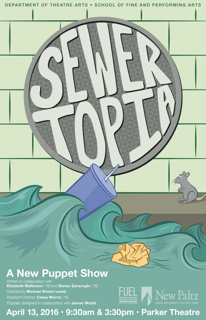
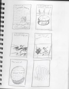
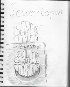
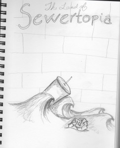
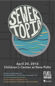
While creating my poster, I attempted to address the target audience by making a design that would seem inviting to children, but would also catch the eye of their parents. I did this by creating a cartoon-like illustration that resembles the underground sewer system using colors that are friendly, and avoided including anything that might be deemed as scary. The logo that I created is meant to resemble a manhole cover, and I fit the name Sewertopia into the circular shape in order to create a more dynamic logotype. The small rat was a last minute decision that I chose to include because young children are often attracted to posters that have characters in them, but in order to leave the mystery of what happens in the play, I wanted to use something you might see in any sewer.
I’ve included the hand-drawn sketches that I worked from, as well as my first poster design that I worked on before settling on this final version.
My name is Kelly McInerney and I am a Junior in the Graphic Design BFA program who will be graduating in the spring of 2017. Print design and digital design are both passions of mine, and I particularly love creating digital illustrations.
