I wanted to try directly re-creating past collages I did by hand via Photoshop. It gave me a chance to directly compare the process of manual vs digital collaging and was really interesting to compare the two experiences (as well as the final results in both cases). A pro for the digital collage is color clarity is certainly better in looking at the piece, though there still remains the question of the quality of the image when printing it out.  Also, I don’t have to worry too much about the technical issues of cutting things out to have it no fit and then having to reprint the same image multiple times to make it fit. But I also find that that struggle in collage-making allows for further problem solving that does not come up the same way using digital means.

Original Collage on top vs Digital collage on bottom

Original Collage on top vs Digital collage on bottom

Original Collage on top vs Digital collage on bottom

https://hawksites.newpaltz.edu/gsrf16/files/2017/03/IMG_1118-1isto9r.jpg

Original Collage on top vs Digital collage on bottom

I also ended up creating this other piece digitally, inspired by the work above. I had wanted to try this before, but physically cutting the leaves to create dimension between the nature and walls had proved to difficult.

Now that I’ve come up with a better, more organized way of presenting my data, I have begun transferring previous data from past visits into the new format.

Thus far, I have been to MoMA 2 times and am anticipating being able to go at least 2 more times before summer.  It has been particularly interesting to see the changing of the exhibitions and the museum space itself. Even in the course of 2-3 weeks, an entirely new exhbition opened and took the place of one that I went to before. Having a direct comparison of two different shows was incredibly interesting to compare how the shows were arranged and presented.

I’ve been also noting the ways that museum chooses to organize it’s spaces/exhibits and my opinions of best practices in their exhibitions. As I have mentioned before, I have found that MoMA’s general approach in their online seminars has been encouraging deeper understanding of art through open-ended questions and letting the viewer feel free to explore an image how they see fit. As a result, it is not expected that every piece on display have a label going into depth about the artist/piece itself. By doing so and telling the viewer direct information, the viewers ability to separate their own thoughts/opinions of the work can be tied to the information they are given. However, that is not to say that this is always the best practice. As I’m sure we all know, Modern Art is extremely complex, with different eras and styles involved, all of which can have deeper meanings. There have been exhibitions that I have gone too at MoMA in which, as someone unfamiliar with the work being displayed, explanations would have helped me better understand various art styles and movements, and how the artists related to such movements.  It ultimately leads to a constant back and forth of just how much information should be given, and perhaps furthermore, in what way can it be presented. Put too much information, and the viewers can lose sight of their own interpretation or even become overwhelmed by the information presented. Likewise, having no information presented can easily overwhelm a viewer and create feelings of confusion and even doubt of understanding a piece. There is no one simple solution- it is all about being aware of your audience and how they can perceive information. The issue I have found at MoMA is with such a variety of different people visiting, the demographics of who sees a work is too vast to be able to specify one way of really learning/teaching.  Contrary, while my own students do differ in learning styles, I at least have the per-existing knowledge of what works best for each students.

This past week I was in a car accident that put me out of work for two days. As a result, I wasn’t able to spend as much time as I had wanted on my artwork. I’m planning this week on catching up with some more collages (in particular going back to physical collaging). I also thing it may be interesting to to do of the same collage, with one as a digital and one as a physical, and compare them to see how the process can work out for each.

As I have been working on my collages, I have been more and more interested in looking at artists that focus on surrealism. Surrealism has always interested me with it’s aim to “resolve the previously contradictory conditions of dream and reality”. The idea of digging further into the subconscious to create art is certainly in correlation with my own practices in my art making. As I have said before, my art can often say something that I mean to say, but there are also hidden messages as well that I am not always immediately aware of. Surrealism’s approach in reaching into the subconscious and unlock our full potential of creativity is certainly one that I can relate to.

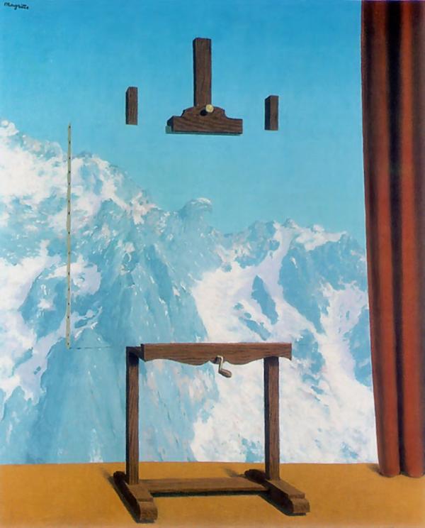
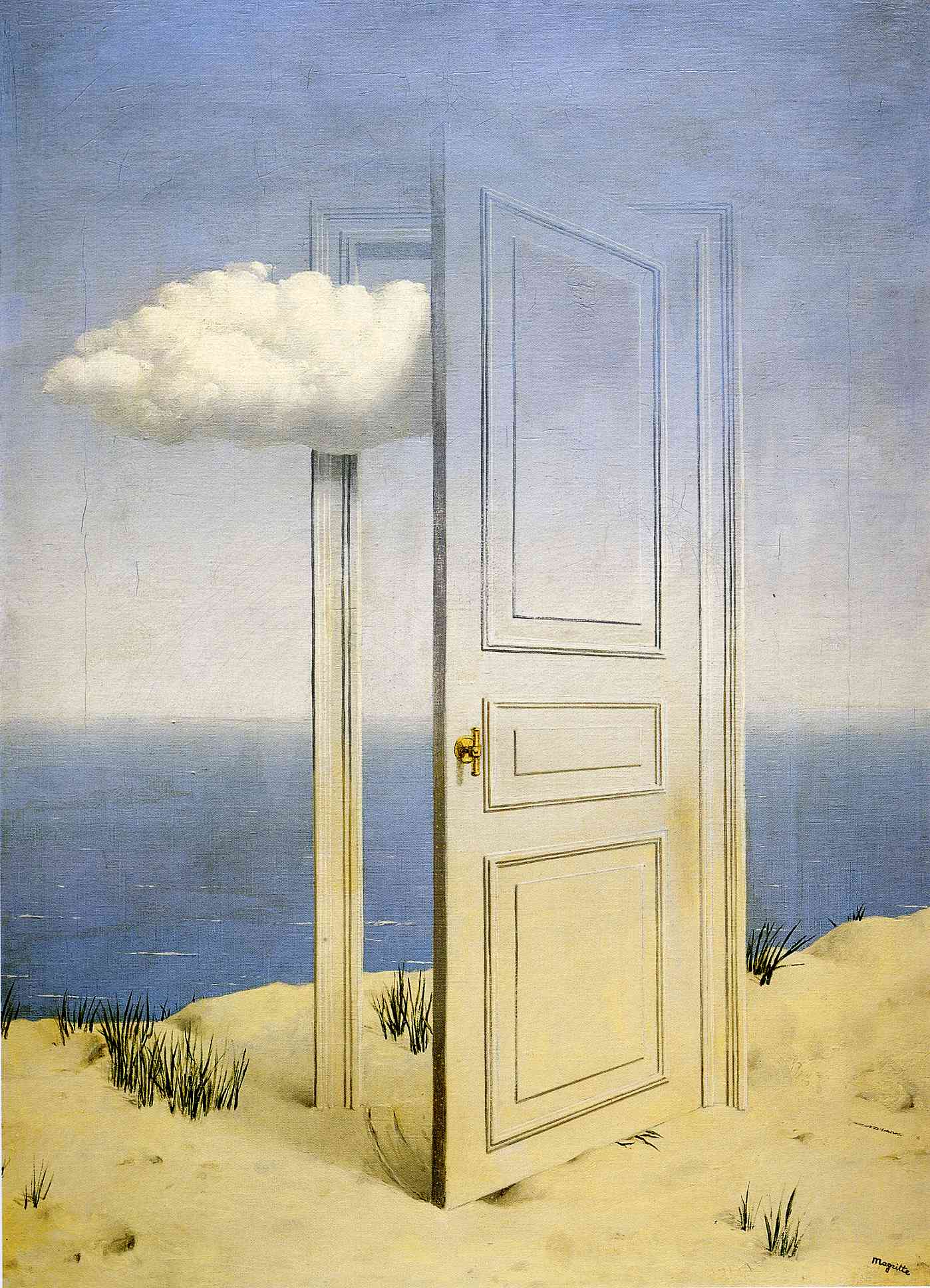
I started out looking at the art of Dali and Breton before I made my way to Magritte. Magritte’s work has always interested me with how he warps the reality of the painting and his painting style is similar to older looking photos I have seen. When I see Magritte’s paintings, I cannot help but think about how I myself have utilized similar techniques on my collages to create similar images. Through utilizing common images and placing them in extreme contexts, he sought to have his viewers question the ability of art to truly represent an object. Going off of this same idea, my art often utilizes familiar places with elements of extreme contrast, questioning the reality of what we are seeing, as well as further questioning the idea of memory and what is and is not real. I am certainly interested in looking further into Surrealism and different, lesser known artists from the movement.

http://www.cuded.com/wp-content/uploads/2014/02/Call-of-peaks.jpg

“Call of the Peaks”, 1943

https://uploads3.wikiart.org/images/rene-magritte/the-victory-1939(1).jpg

“The Victory”, 1939

The Glass Key - Title for this painting is borrowed from Hammett’s novel, La clef de verre. Inspired by the work of fiction, Magritte conjured a poetic dialogue of the state and the dynamism of words and images, presented by the depicted rock, title and the perplexity of their connection.

“The Glass Key”, 1959

https://i0.wp.com/www.guggenheim.org/wp-content/uploads/1931/01/76.2553.101_ph_web.jpg?w=870

“Voice of Space”, 1931

This past weekend I finally had the chance to go back to MoMA. Since the last time I was there, one of the previous shows I visited had closed and two new ones were opened. I attended the two shows- “Unfinished Conversations: New Work from the Collection” and “Making Space: Women Artists and Postwar Abstraction”. I started off with similar note-taking that I have done before, recording what is on display, information provided, set up, etc…

Upon looking at these findings, I ended up coming up with a method to better organize my findings.The title of the exhibition is shortened in the middle, with the number on top symbolizing the spaces available to contemplate the art/rest and the bottom number any additional resources immediately available (such as exhibition catalogues or books about specific artists). The color/line around it represented my overall feeling/mood while in the exhibition. The dashes in the circle represent each piece and label on display and are meant to be read clockwise in the order of the exhibition itself. It ends up coming full circle as the exhibition spaces at MoMA always lead back to the start of the exhibition. The orange “i” coming out of each represents additional information provided about the piece or artist that made it. The red lines along the outside represent what I observed as acting barriers between the viewer and pieces. “MS” (Making Space) additionally catalogued all of the works according to genre type so I chose to demonstrate that by separating them off into colored sections.

“Making Space: Women Artists and Postwar Abstraction” Data

“Unfinished Conversations: New Work from the Collection” Data

I’m really liking this organization style and am working on transferring the data I have already on past exhibitions into this same format. I am hoping to go back to MoMA again for a third time in the next couple of weeks, perhaps on a weekday where I will be able to directly compare the experience of visiting the museum outside of the peak weekend times that I have visited during. I will be utilizing data collected about the museum visits as well to create another data visualization similar to the current setup I have.

In this week’s collages, I decided to try digital collage rather than physical. The benefit to utilizing digital methods is that the images can look more “lifelike”/real, though not always. I feel like the digital collage works well in some cases but not all of them. A pro for the digital collages is that it would certainly be easier to have larger-scale images for the show this summer as I can simply have them printed large-scale. I’m going to try utilizing both digital and physical methods and not restrict myself to only one way of collaging.

I just got back from Japan last night and still in Japan time but figured I would upload some pictures from my time there. Along with these and many many other photos, I also have various maps, tickets, and pamphlets from Japan that I am interested in including in my upcoming collages. It was really interesting to see the relationship that the Japanese have with nature, especially in larger cities like Tokyo.

I currently am in the process of getting ready for my next visit to MoMA- this includes looking more at exhibitions that are on display and preparing questions to address in my next visit. I only got to go to MoMA once in March unfortunately, but I am planning on going back there at last 3-4 more times by June. Doing the 2nd visualization really got me thinking about specific observations to make/keep note of while I am at the museum and that has certainly helped in preparing me for my next visit.I am continuing to use photographs as direct observations, but am planning on visually tracking my observations while actually at MoMA.

I am also continuing to utilize the digital resources offered by MoMA and looking closer at specific ways pedagogy is based. I have found in particular that when teaching educators, MoMA encourages inquiry-based learning through open-ended questions and room for interpretation. Yet at the same time, I have also found some descriptions at the physical site of MoMA that give direct information about the work/artist and that is leading me to consider the role that inquiry-based learning has and in what type of environment it should be offered (in a formal, educator-led setting or a casual, open setting for everyday viewers). It certainly leads to thinking more about my own pedagogic approaches and when I utilize specific learning techniques/approaches versus when I do not.

This week was a really tough week for me, both personally and at work. I’ve been feeling especially depressed recently and overwhelmed and I feel like it really affected me in my art-making as well. I ended up also re-visiting one of the collages I did last week, putting in the cutout from it on the top of it and I’m not really sure how I feel about it. This time next week I will be in Japan, and that thought really has been what is getting me through the week (as such it really controlled the imagery I used this week). If I can before I leave, I want to try revisiting the third picture- the concept of the torii gate in the hall I like, but the execution of it was poorly done.

I also found some cutouts from a picture and some paper that has drips of paint and ink on it and just thought the visuals on it were pretty interesting to look at.