
The Faculty Development Center, Instructional Technology, and Graduate and Extended Learning present this workshop in collaboration with Assistant Professor Joshua Korenblat
Data Visualization Tips and Tools for Communicating your Research Workshop
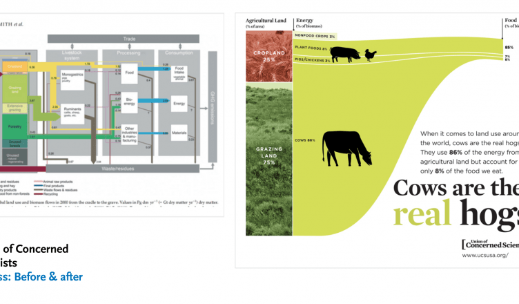
Do you have a data-informed story that you want to include in a research paper or presentation? This workshop is for faculty and staff who have data-informed stories they need to tell. These stories work best as tables, charts, and maps.
In this workshop, I’ll cover best practices of telling data-informed stories that are appropriate matches for your audience and situation. For example, experts might appreciate more elaborate charts, while non-experts might appreciate simple charts. I’ll share some design principles for the visual communication of your research, including the scaffolding around your table, chart, or map—and the writing that goes with it.
I’ll also share intuitive resources that you can use for picking how to represent your data visually. We’ll also discuss resources for making your tables, charts, and maps, and focus on particular design tips, such as working with color and type.
One part of this workshop will be introducing this content. The other part will be sharing the chart or map that you want to publish or present. We can use Miro, a whiteboarding app, to do some ‘chart triage’ and make recommendations for a redesign.
Please bring your data-informed story: it can be a table, a chart, or a map that you’ve already been making. This workshop is not about exploring the data to uncover a story; instead, it’s about visually communicating the story using design principles, so your table, chart, or map isn’t too complicated and doesn’t induce confusion.
Recorded Session: Data Visualization Tips and Tools